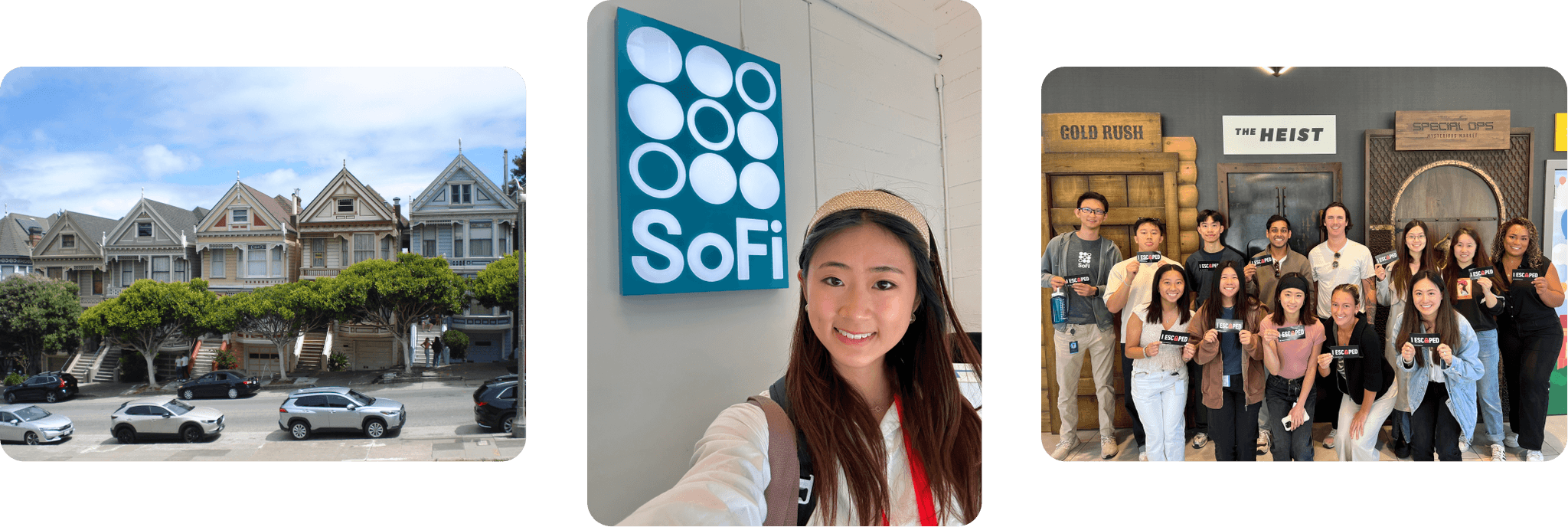
SoFi • 8 min read
Onboarding & Applications
Streamlining 4 product flows with the goal of increasing application submission rate for 9M members
ROLE
Product Design Intern
STAKEHOLDERS
Design, Product, Engineering, Research, Business, UX Writing
TOOLS
Figma, Maze, Amplitude, React Storybook, Jira
TIMELINE
Jun to Sep 2024
(3 months)
DELIVERABLES
Discovery insights
Usability testing
Final specs
Exec presentations
✨ HIGHLIGHTS
Led an end-to-end redesign of three product flows that shipped in 2025
Drove a 25% increase in submission rate of the Small Business financing application
Won an intern case study competition and drove SEO improvements outside of my project
BACKGROUND
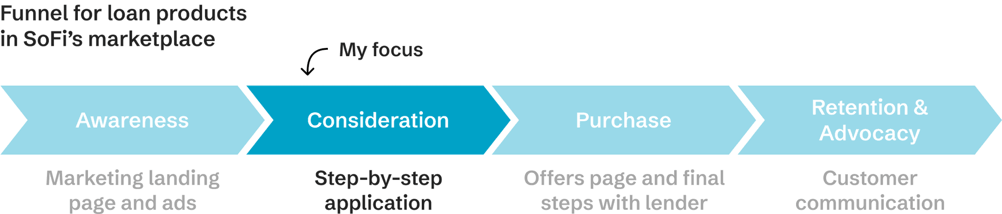
SoFi's marketplace — personalized loan offers in one application
I worked on SoFi’s marketplace, a service to help members shop and find financing, including personal loans, student loan refinancing, and business loans. While SoFi doesn’t provide loans directly, their marketplace can help people quickly find financing solutions in one application.
📖 DEFINITION
Funnel: In the context of my project, "funnel" refers to the steps a customer goes through from initial interest in a loan to the final stage of receiving funding.
PROJECT GOAL
Giving our application funnels a makeover
SoFi was experiencing a user drop off issue across their loan application funnels. They tasked me with redesigning the user experiences to increase application submission rates.
Requirements:
Unify the user experience across 4 product flows
Apply SoFi's new Pacific Design System
Optimize the application funnels to reduce user friction
🔮 OPPORTUNITY
Expand SoFi's customer base to small business owners in the US (33.2 million, 46% of the labor market) by growing their new Small Business product
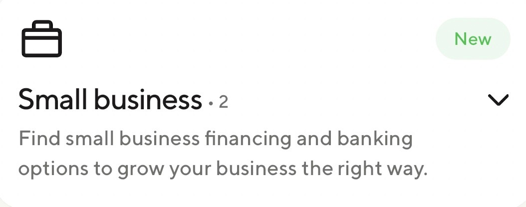
Note: I'll mention the Small Business Loan product flow a lot throughout this case study, as it was a high priority for my team.
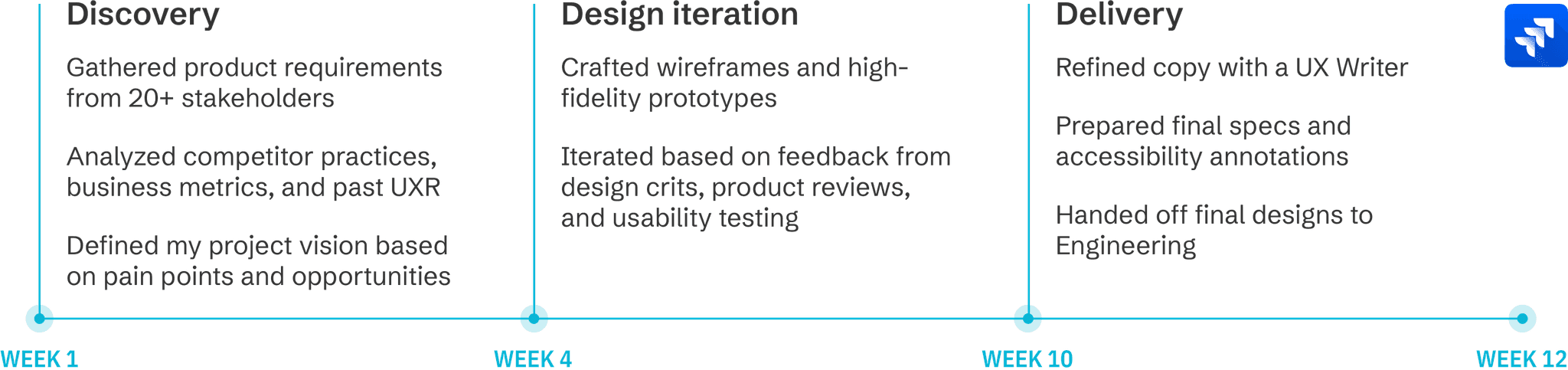
TIMELINE
End-to-end design process
This is how I budgeted my time, from discovery to delivery. I also learned Jira to give teammates visibility into my work.
FINAL SOLUTION
Consistent UX
Source of truth for common pages
A true one-stop-shop experience for members. Reliable reference screens for designers. All in SoFi's new Pacific Design System.
Elevated Product Quality
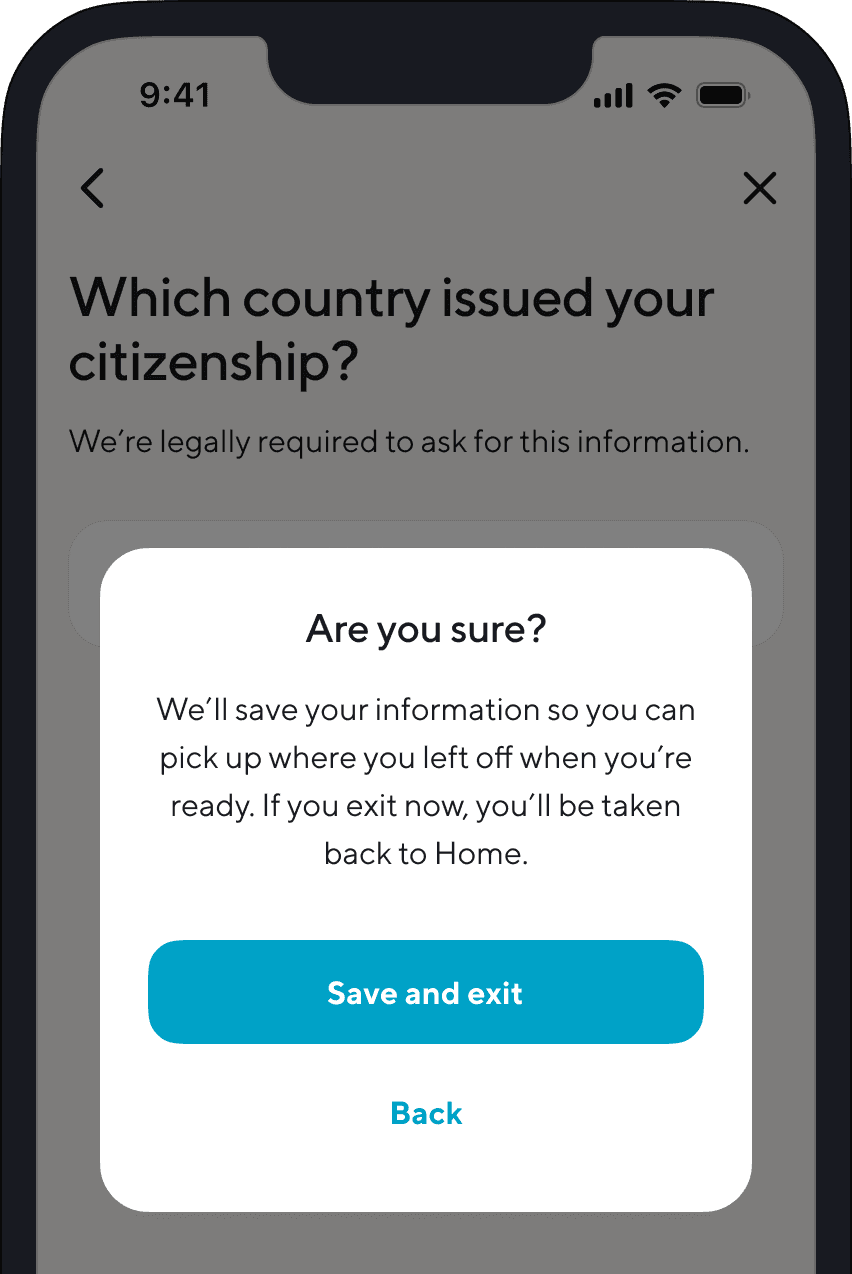
Save and exit
Have reassurance that your application will be saved before you exit.
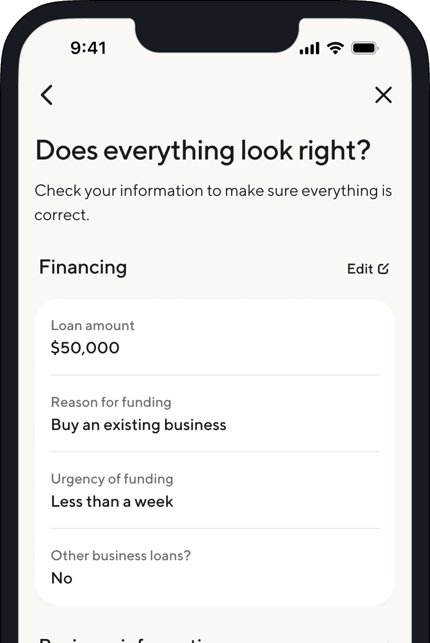
Review information
Check that everything is correct. If needed, make edits from this page.
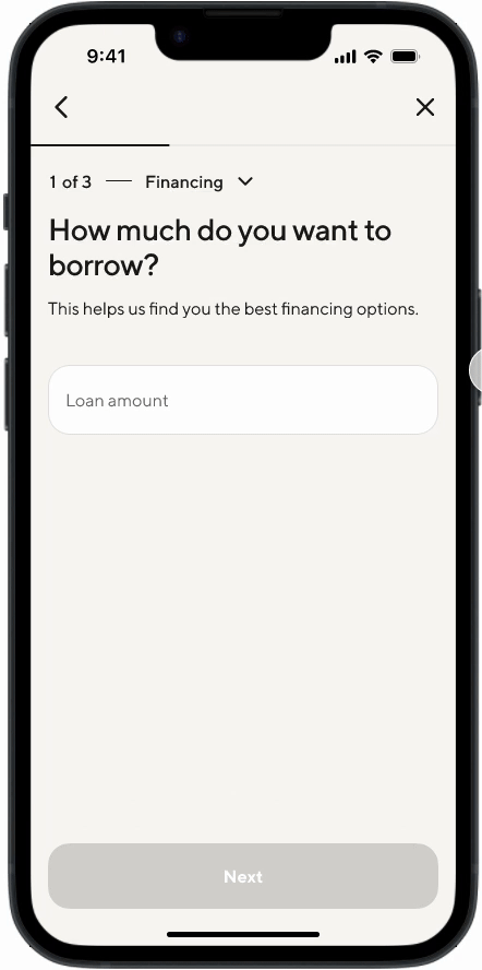
Funnel Optimizations
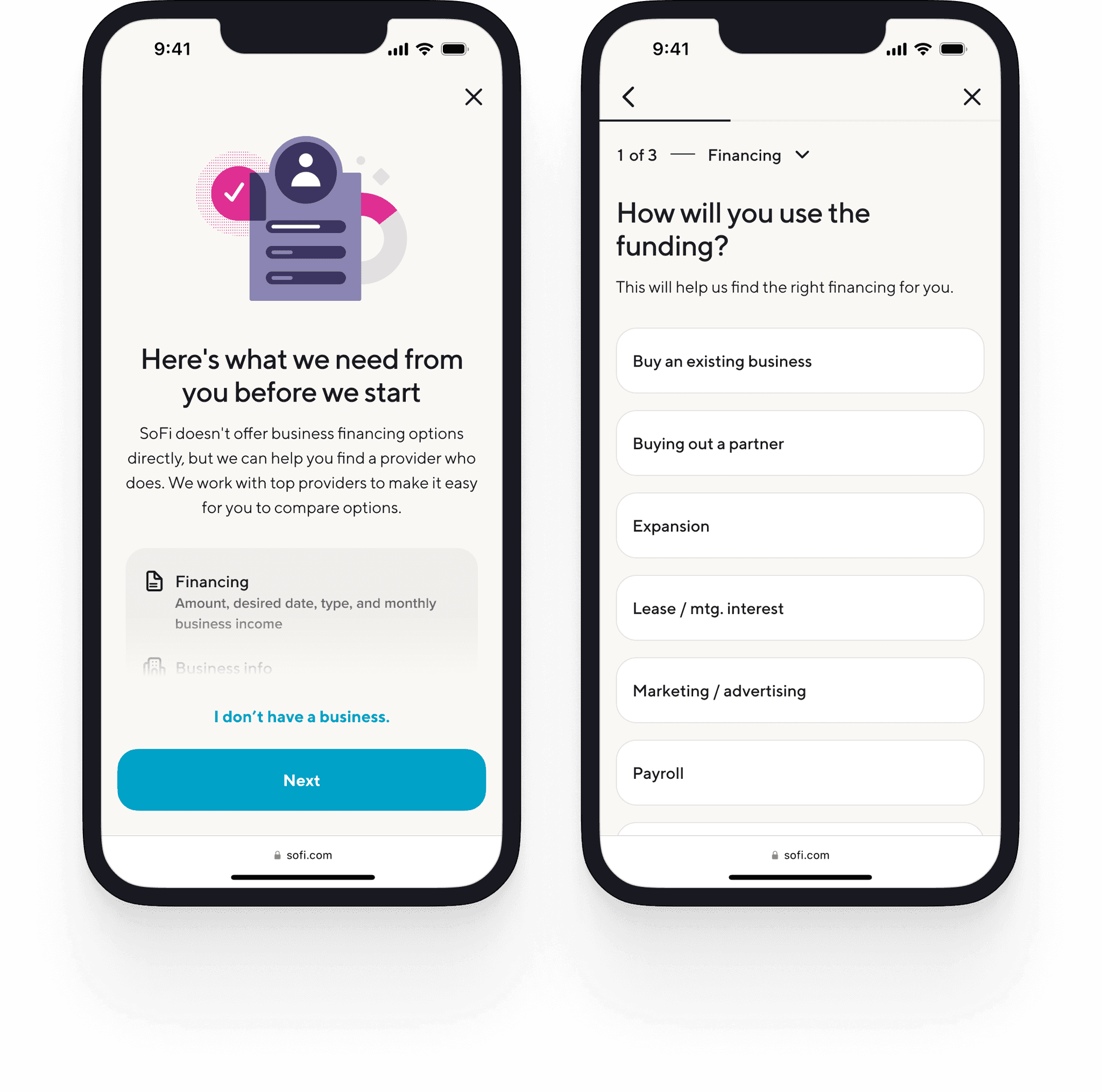
Added explainer text
Explains 'why' to increase the willingness of applicants to provide info.
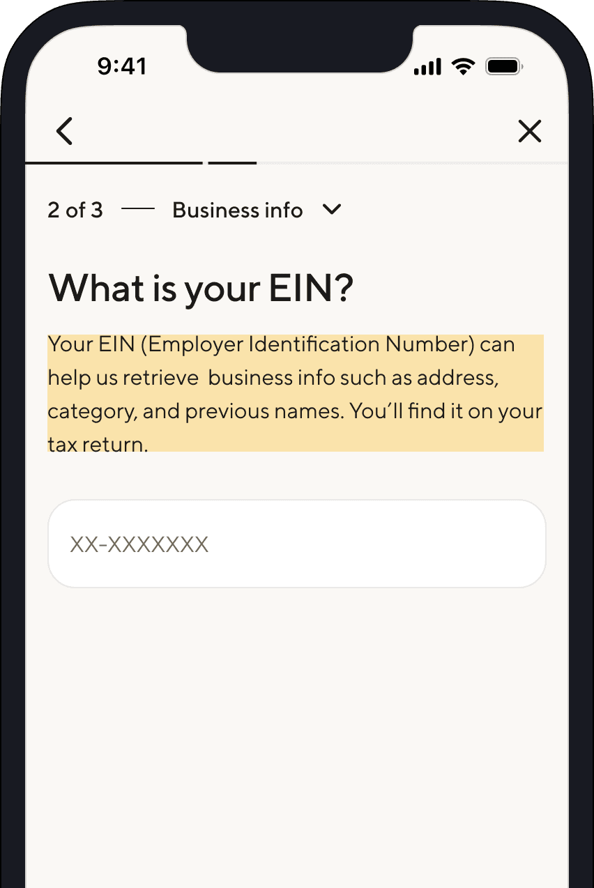
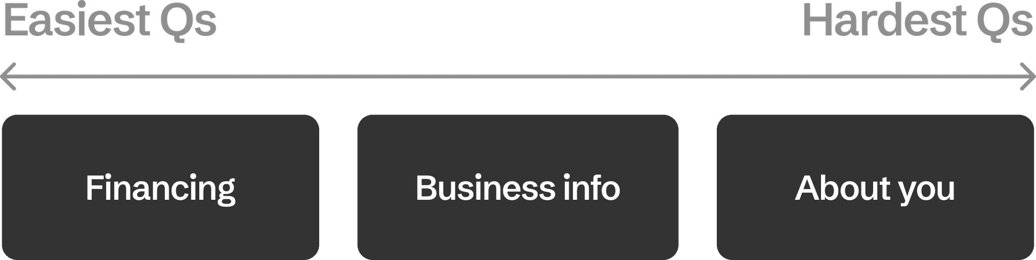
Reordered questions
Asks easier questions upfront and harder questions downstream to reduce user friction.
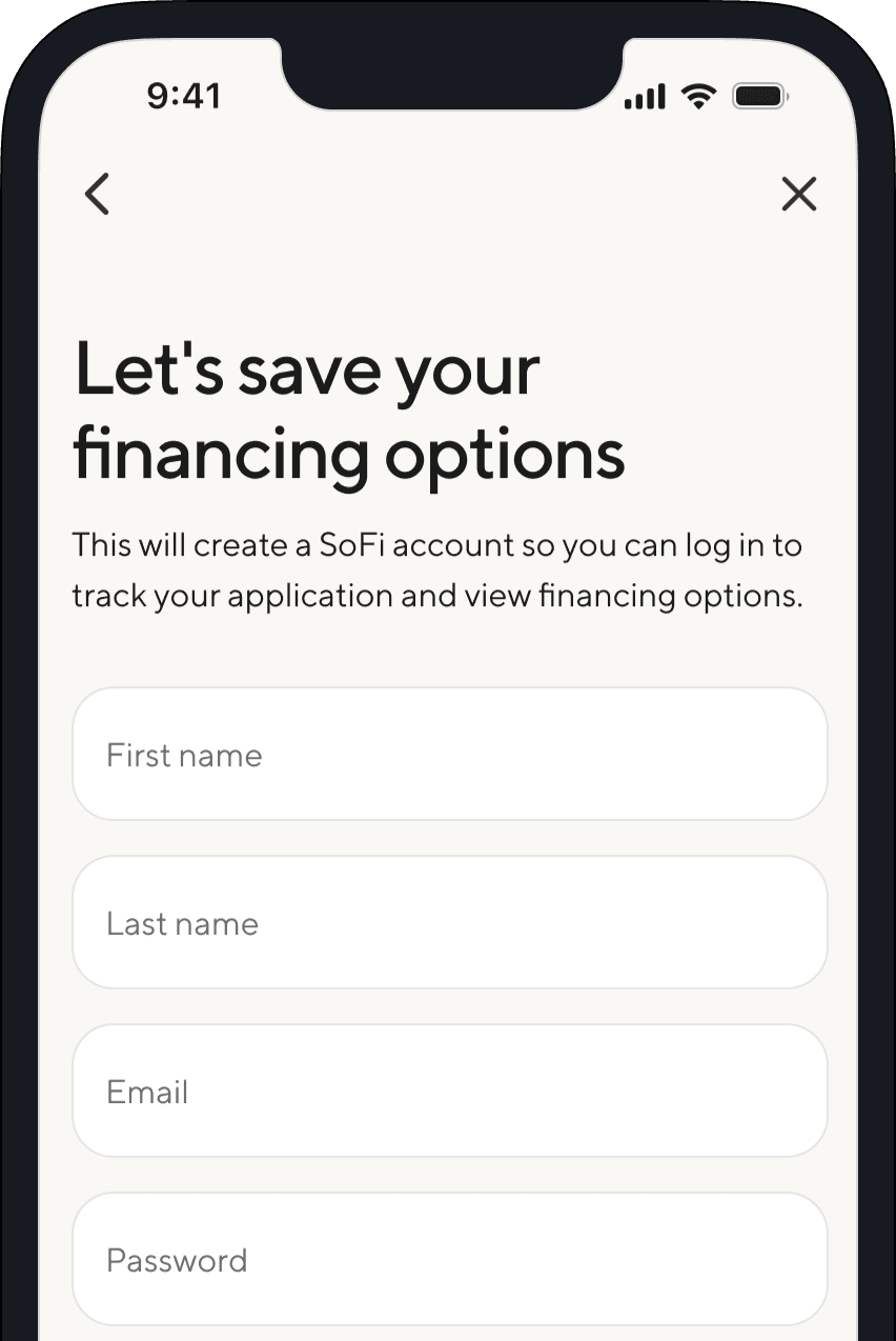
Soft registration
Saves registration until the end, when applicants are more committed.
Bonus contribution to SoFi's design system
Global improvements to SoFi's CTA navigation pattern
A more seamless funnel experience that also requires fewer clicks.
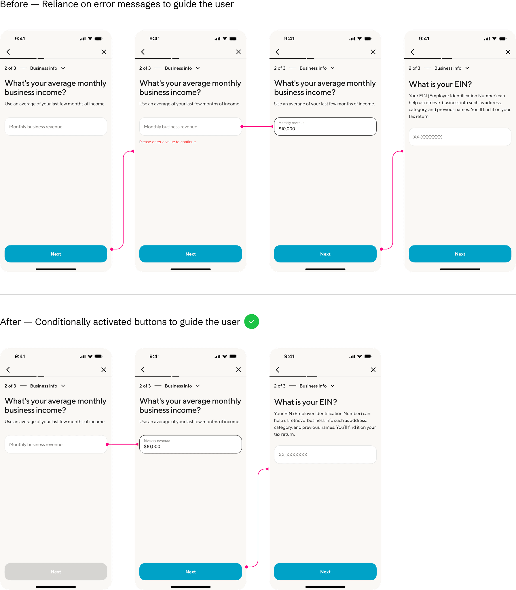
(1) Conditionally-activated 'next' button for usability
(2) Auto-advance in multiple-choice questions for efficiency
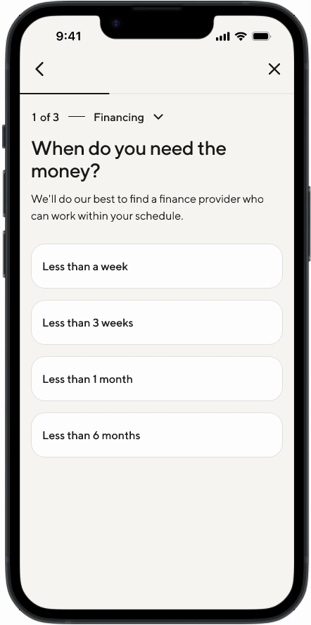
DISCOVERY / WEEKS 1-3
DISCOVERY
User pain points
Beyond my initial conversations with my Design Manager and PM, I used direct observation and data to further diagnose the problem. I tested the funnels (100+ total screens) with fresh eyes, noting any bugs or ideas. I also pulled relevant insights from past UX research and metrics.
🚩 Inconsistency
Our loading screens were all over the place. So were common pages, including phone number, SSN, etc.
CURRENT EXPERIENCE AUDIT
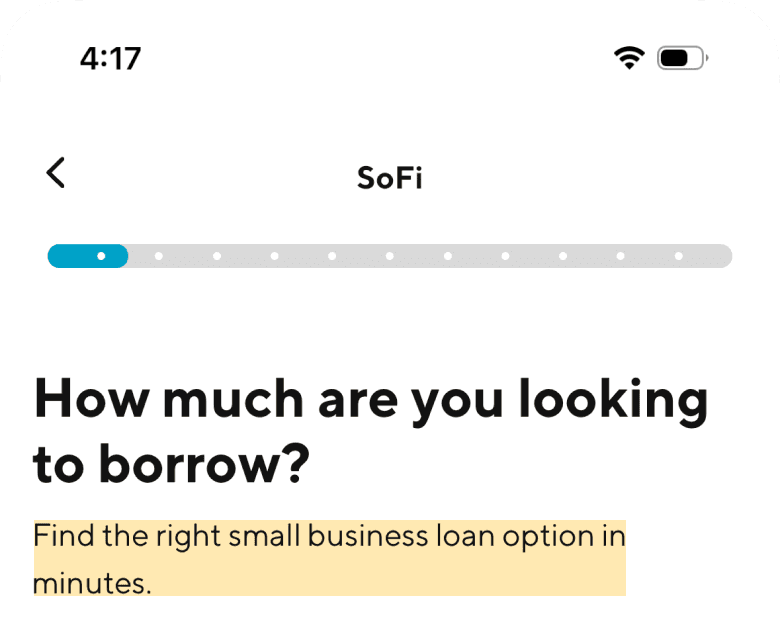
🚩 Confusing copy
Distracting marketing messaging (highlighted) was shown in the middle of the application funnel.
PAST UX RESEARCH
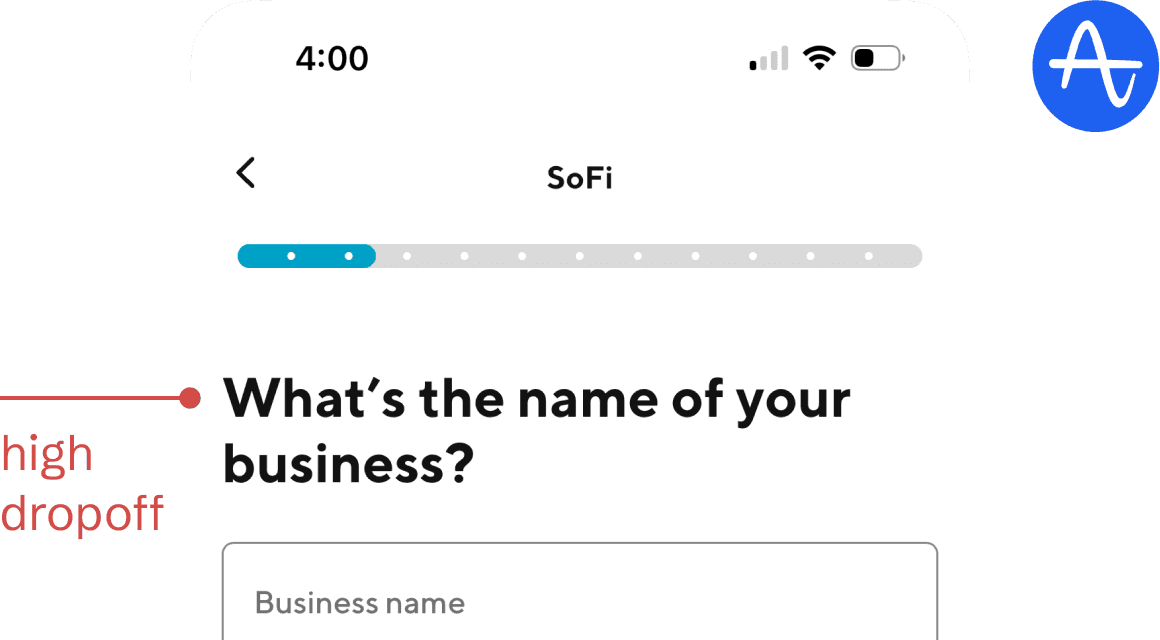
High drop off was occurring at the Business Name question because it was awkward to answer for prospective business owners.
FUNNEL CONVERSION METRICS
FRAMING THE PROBLEM
SoFi lacked a clear design vision for its 4+ financing application funnels, resulting in widespread inconsistencies and product quality issues in the customer experience.
DISCOVERY
Opportunities
I presented many opportunities, with their potential pros and cons, to my design and cross-functional teammates. We made the following decisions:
DESIGN VISION
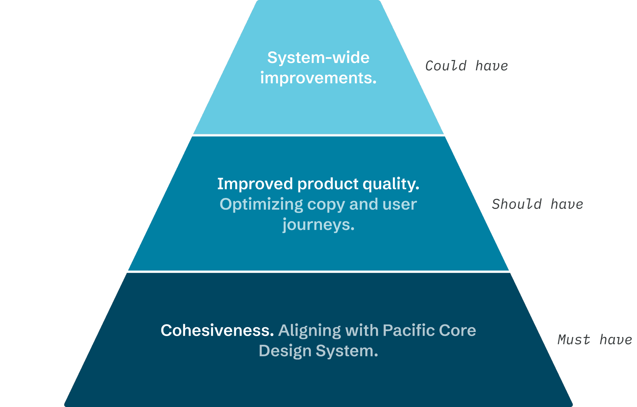
Must, should, and could have's
With a clearer grasp of the situation, I defined 'what success looks like.' This allowed me to aim high while still prioritizing critical tasks within my timeline.
DESIGN ITERATION / WEEKS 4-9
INFORMATION ARCHITECTURE
Starting with the basics
I started with information architecture to reorganize the content in an intuitive way. I dissected the three application funnels, then constructed a framework that could fit all of them (with some flexibility, of course).
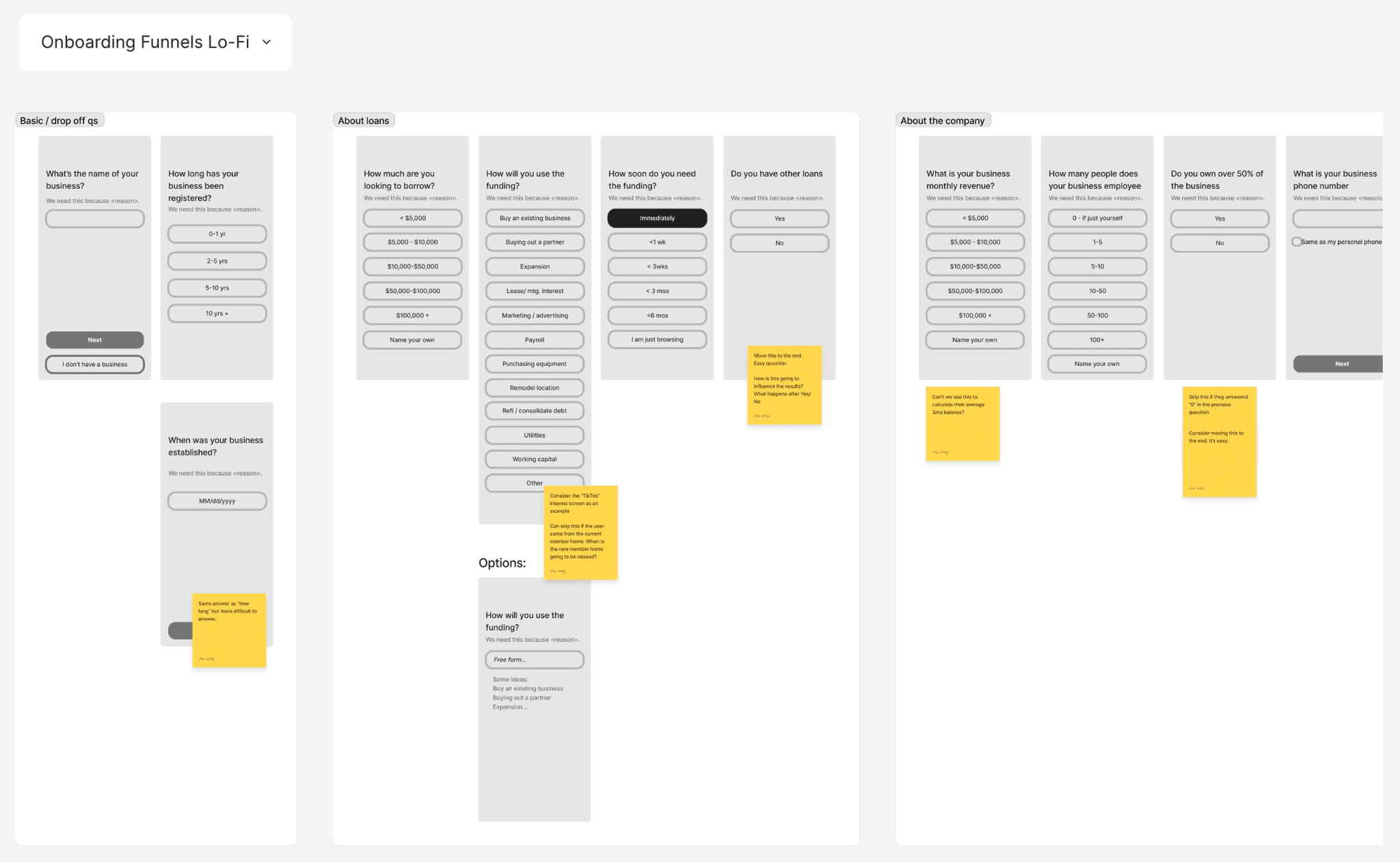
Lo-fi screens + early feedback on stickies
ITERATION
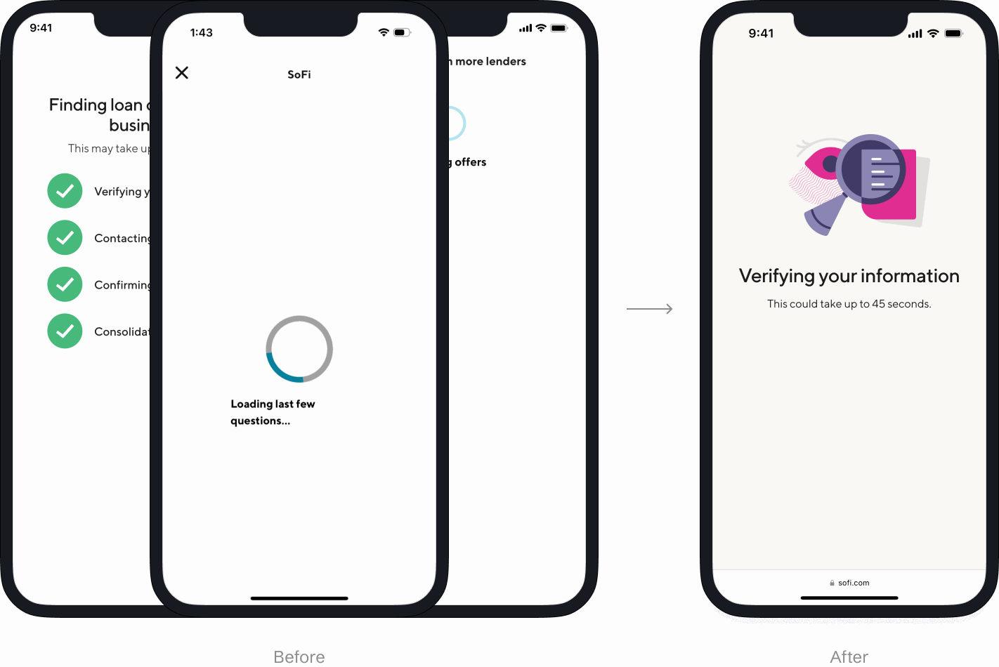
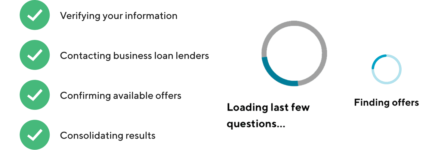
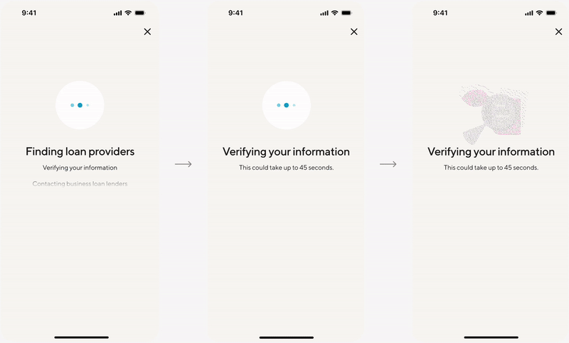
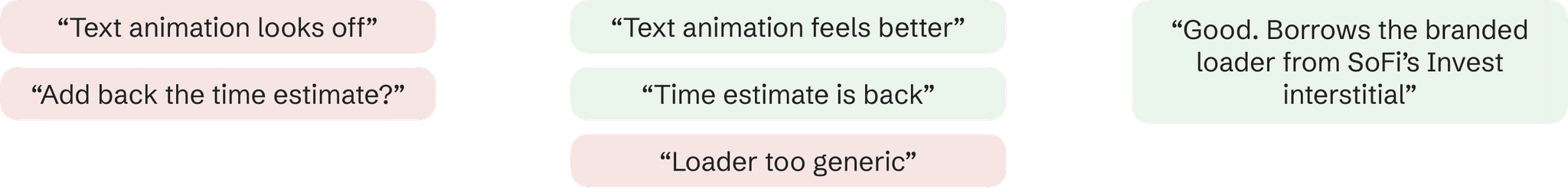
Interstitial for application screening
In the hi-fi stage, I sought additional feedback in design critiques and product reviews. The goal of this design was to unify the interstitials (loading screens) for our application funnels.
I defined and followed these design principles:
Scalable. Loader and copy can work for various product flows.
Feels fast. Animation that exudes confidence in users.
Visibility of system status. An applicable Nielsen usability heuristic.

ITERATION
Questioning SoFi's CTA navigation pattern
During a cross-design crit, several designers expressed concerns about the official SoFi CTA navigation pattern in my designs. They found it problematic that users could click the 'Next' button without providing any information. In response, I got to work on a design proposal.
I successfully persuaded the Design Systems team by…
Asking how the current design pattern came to be so we could make an informed decision together.
Demoing the proposed interaction by preparing a prototype ahead of time.
Highlighting that it was a best practice (used by Robinhood and Duolingo).
CHALLENGE
Navigating ambiguity in the design process
My stakeholders had various opinions on the optimal question order to maximize app submission rates. While awaiting UXR card sort results to finalize the order (~3 weeks), I focused on what I could control: reminding stakeholders that the order in my Figma file was a WIP and offering recs from a design perspective.
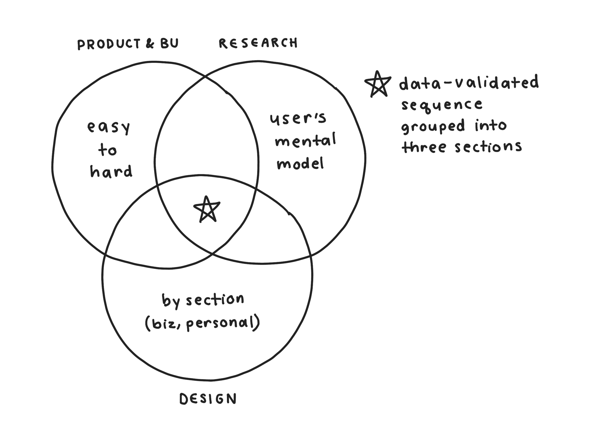
Suggested question order, according to different stakeholders
DELIVERY / WEEKS 10-12
USABILITY TESTING
A positive response from target users
After designing, I partnered with Research to launch a funnel test via Maze. In this test, target users clicked through an interactive, end-to-end prototype of our Small Business Loans application funnel. At the end, they provided open-ended feedback on the experience. This research served as useful a gut test and helped me resolve an issue with our progress bar before implementation.
Participants: N=15; well established business owners, who met minimum requirements for FICO, Monthly Business Revenue, and Time in Business
"The UX of the form is amazing—makes me trust the platform"
FINAL SPECS
A smooth designer-developer handoff
Finally, I led a walkthrough of my final designs to 10 frontend engineers. They helped identify some missing screens using a development environment tool called React Storybook. Overall, they were super excited about the designs! Here's a sneak peak at my documentation:
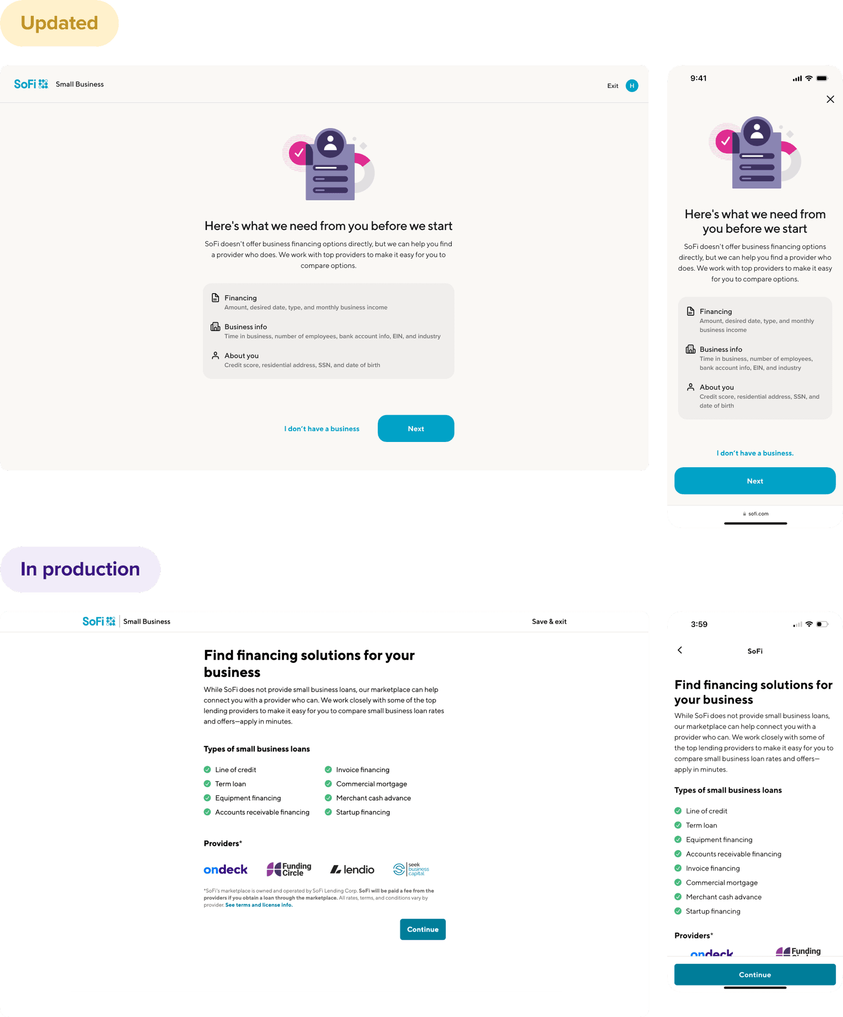
Desktop/Mobile and Updated/In Production screens laid out side-by-side for easy reference
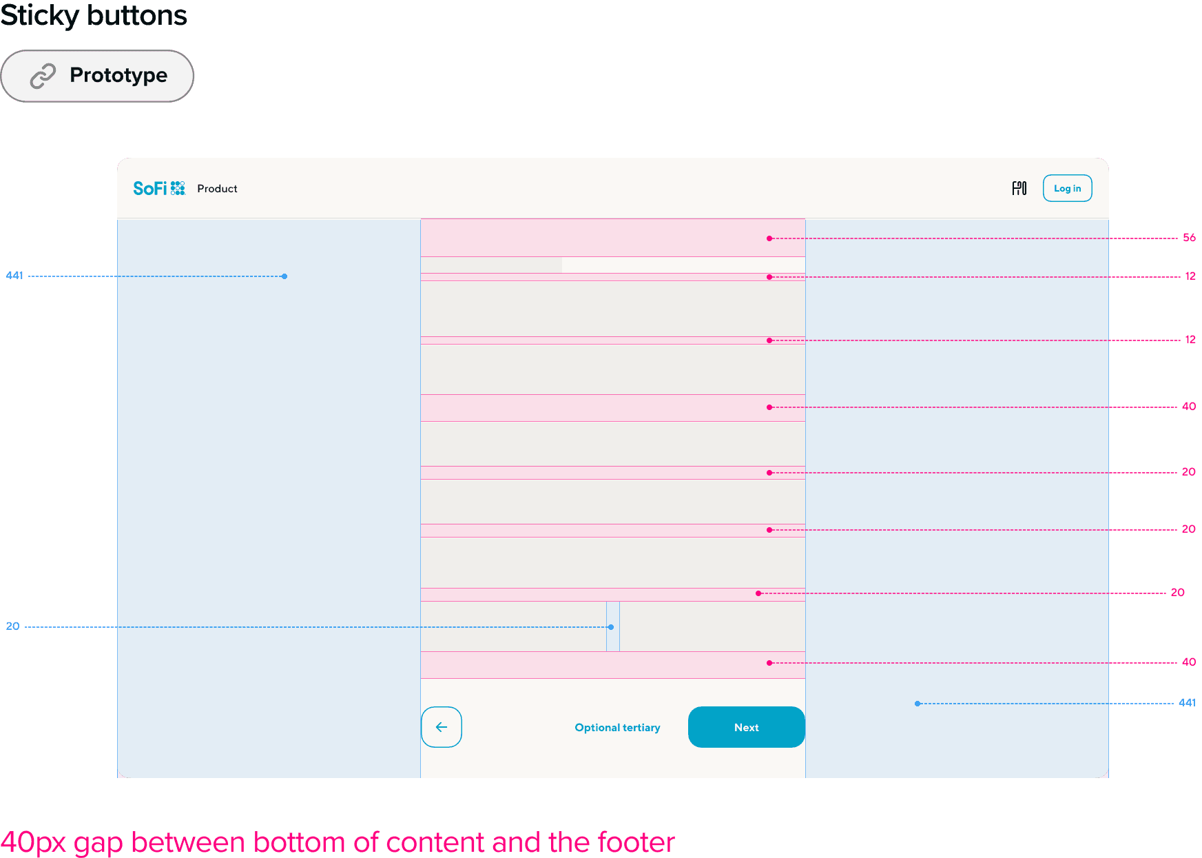
Spacing guidelines and a playable prototype with behavior for sticky buttons
ACCESSIBILITY
Including users with visual impairments
Additionally, I prepared accessibility annotations for screen readers to enable users of all abilities to navigate, understand, and interact with our interfaces.
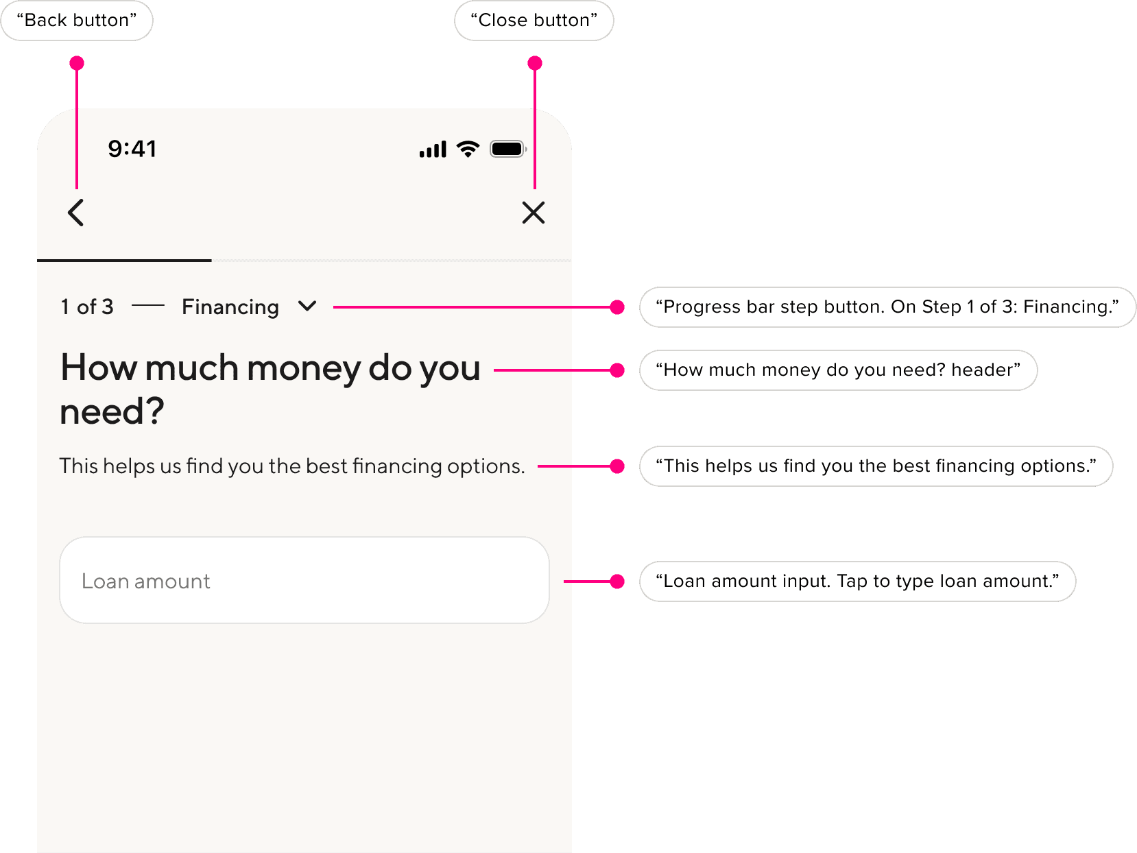
Accessibility annotations for screen readers
IMPACT
Delivering on project requirements and business objectives
Requirement: Unify the user experience across 4 product flows
→ Redesigned Small Business +3 other loan applications from the ground up, executing a design vision with unified screens and user journeys.
Requirement: Apply SoFi's new Pacific Design System
→ Migrated SoFi's new design system to 100+ mobile and desktop web screens. Successfully proposed a new CTA navigation pattern that was adopted globally.
Requirement: Optimize the application funnels to reduce user friction
→ 25% increase in submission rate of Small Business financing application. Optimizations included a data-validated Q order, smart login experience, and explainer text for each Q.
INVOLVEMENT
Other wins
Top-of-funnel improvements
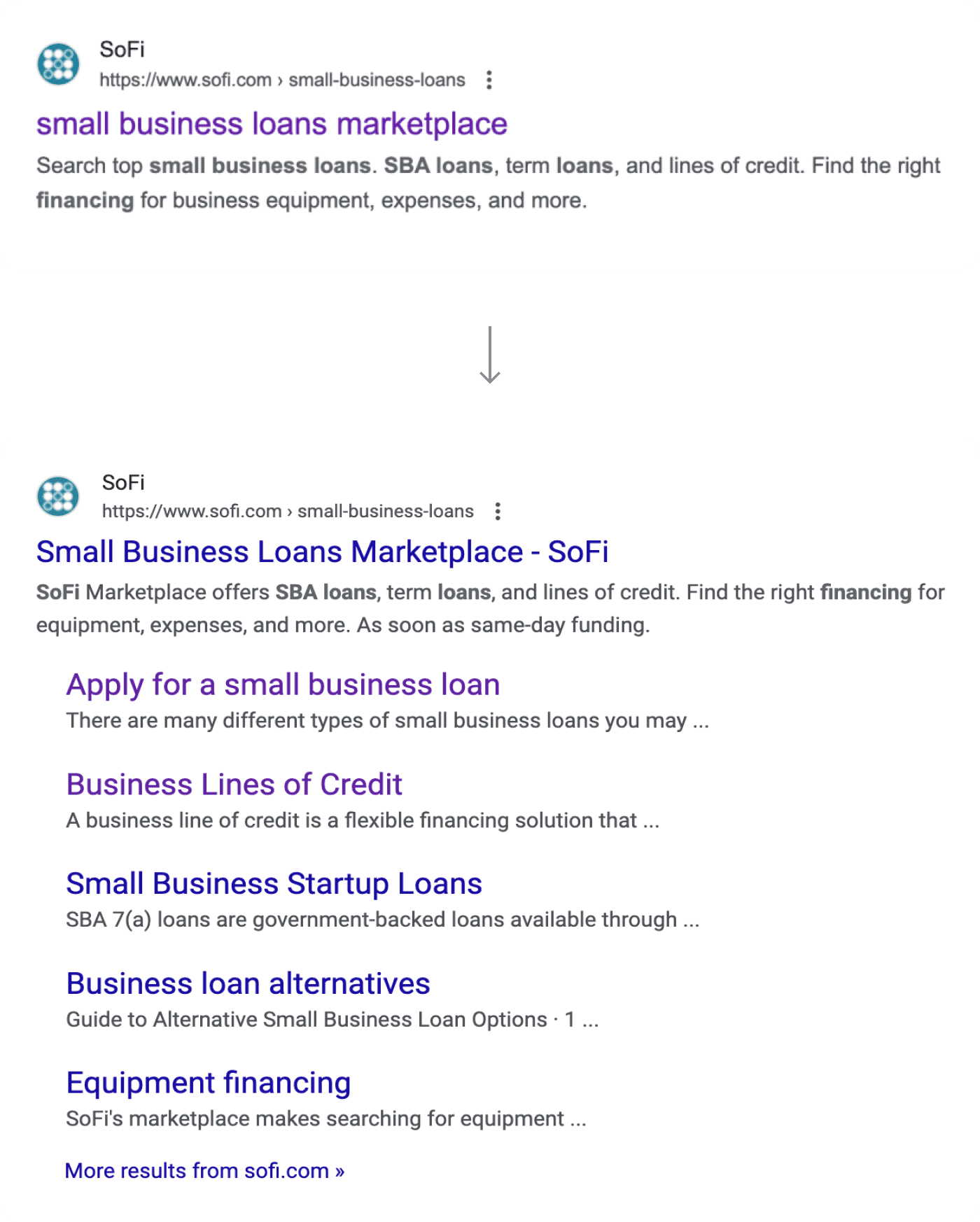
Initiated collaboration with our Director of Product Marketing to improve SEO
1st place in an intern contest
Teamed up with interns; presented a 6-week case study to the CEO
Designed the 2024 intern logo
A cute touch to our "Camp SoFi"-themed happy hour menu
FINAL PRESENTATION
Feedback from the team <3
Thank you so much for your hard work over the past couple of months. You've been tremendous.
MICHAEL S, DESIGN MANAGER
The work you did was really well executed.
RYAN, DIRECTOR OF DESIGN
Wooohoooo ❤️👏 Gooo Mandy!!!!!
JOY, MENTOR & STAFF DESIGNER
I was super impressed by your poise and insights.
MICHAEL B, VP & BUSINESS UNIT LEADER
Thank you so much for not only being proactive and running after problems. As our team was pivoting, you actually were proactive at making sure that you were aware of those changes and getting ahead of the work behind it versus waiting. It's been a great experience working with you. Huge shoutout to Mandy.
LINH, DIRECTOR OF PRODUCT
REFLECTION
What a ride. Thank you, SoFi!
What I would've done differently
Clarify open questions asap
During the first few weeks of my internship, I wasn't entirely clear on the scope of my work just from reading the project brief. Moving forward, I'll make sure to promptly clarify any open questions with teammates.
Learning
Systems thinking
This project called for horizontal design work, requiring a high-level analysis of the situation. I began by focusing on the basics—user flow and information architecture—which laid the foundation for deep design improvements.
Area of growth
Taking feedback with a smile
I once received over 50 Figma comments on my designs during a product review! As a designer, handling extensive feedback is part of the process. I learned to be receptive to different perspectives while still holding onto a clear design vision.
I'm incredibly grateful for the opportunity to join SoFi in revolutionizing personal finance. I learned about fintech, met role models and intern buddies, and had the opportunity to own a project on the company roadmap. This is the just the start of my passion for product design—I look forward to what's next.