
Redbubble • 7 min read
Creator Tools
Passion project aimed at increasing user-generated content (UGC) on Redbubble, an e-commerce platform for independent artists
ROLE
Product Designer
TIMELINE
Dec 2022 (3 weeks)
TEAM
Solo
DELIVERABLES
User interviews
Competitive analysis
User flows
Hi-fi design concepts
Usability testing
✨ HIGHLIGHTS
Practiced the end-to-end design process and product thinking in areas of interest: e-commerce and creator tools
Redbubble noticed my work and invited me to speak with a PM on their Artist Experience Team
I found out many of my solutions were on the team's backlog, which was quite validating
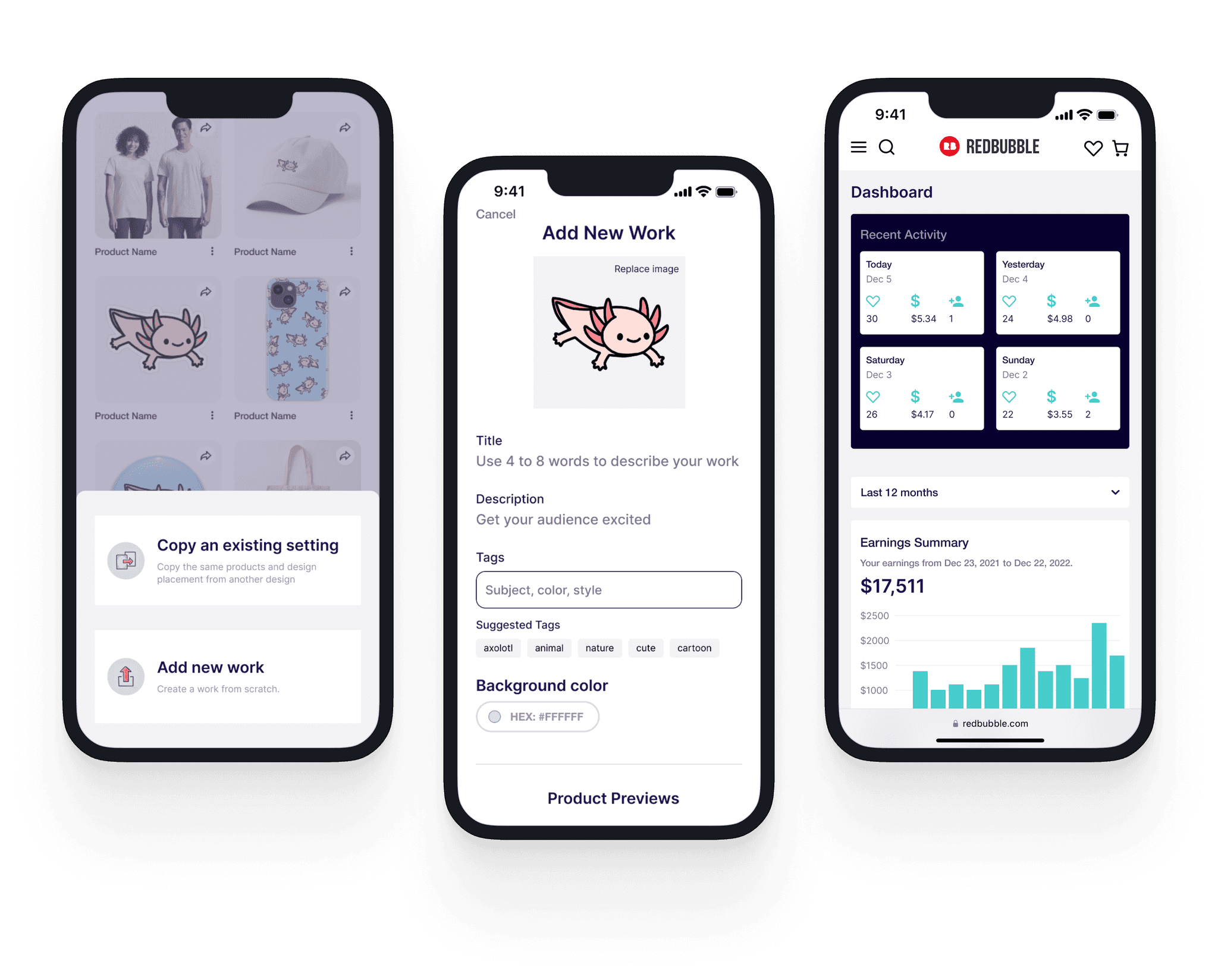
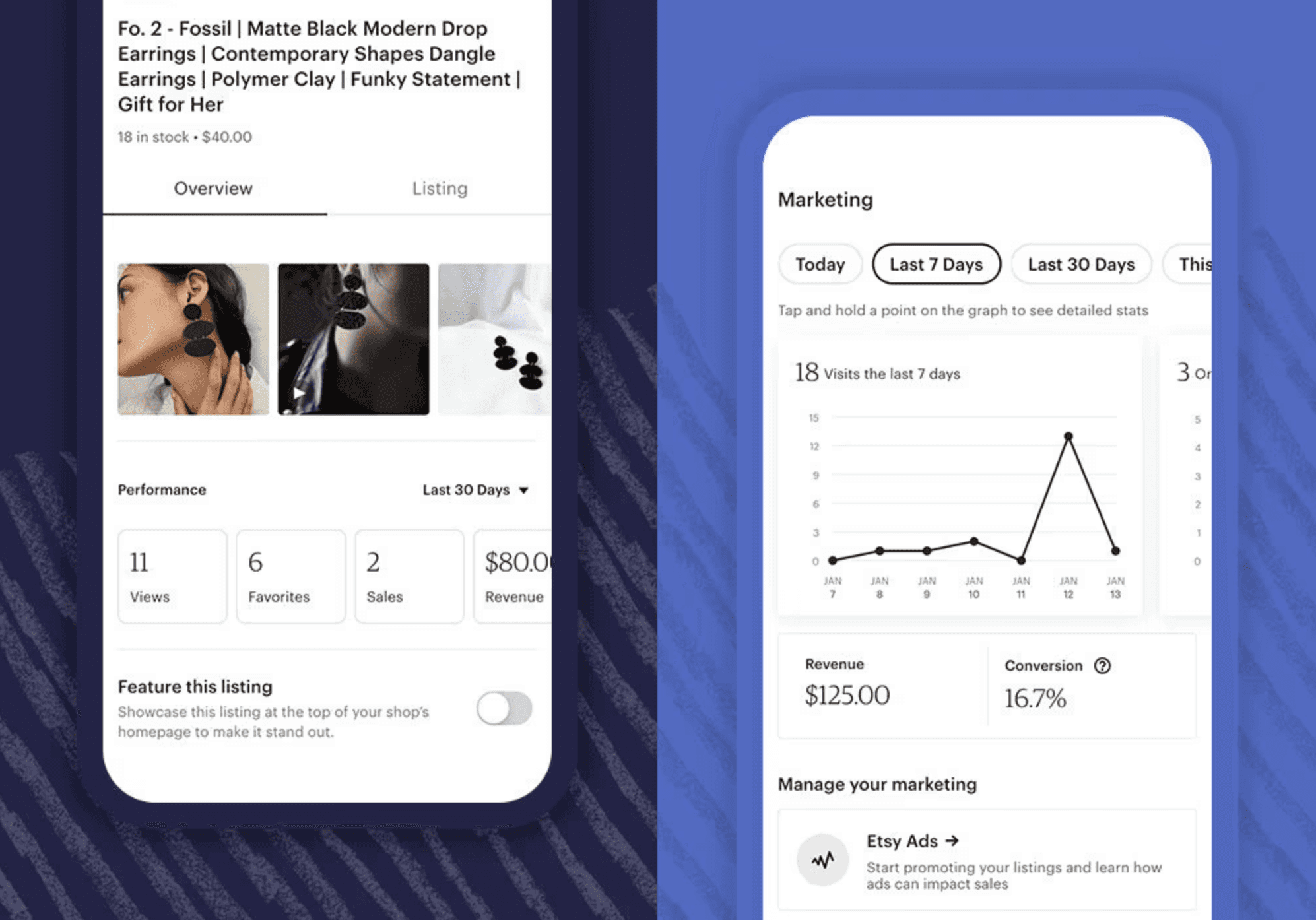
FINAL SOLUTION
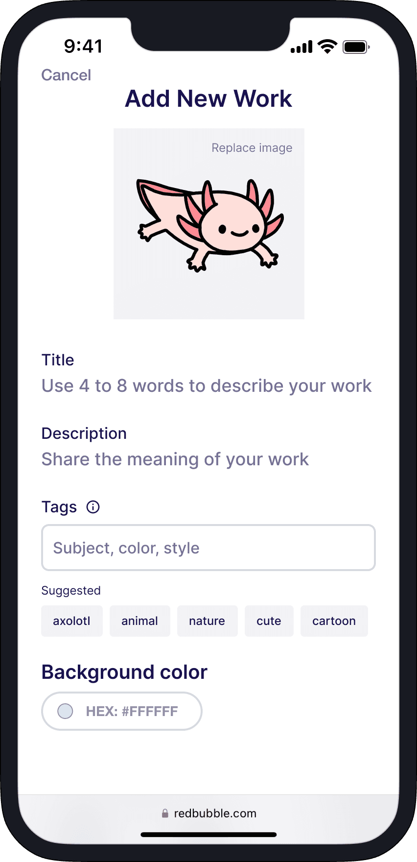
Mobile-friendly web design
I want to have user-friendly interface on mobile, so that I can create content more conveniently
Multi-product editor
I want to make edits across my portfolio, so that I can keep my shop refreshed

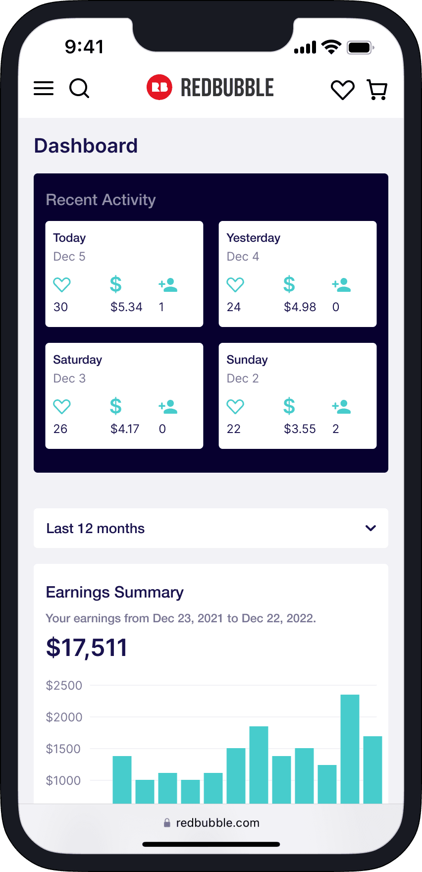
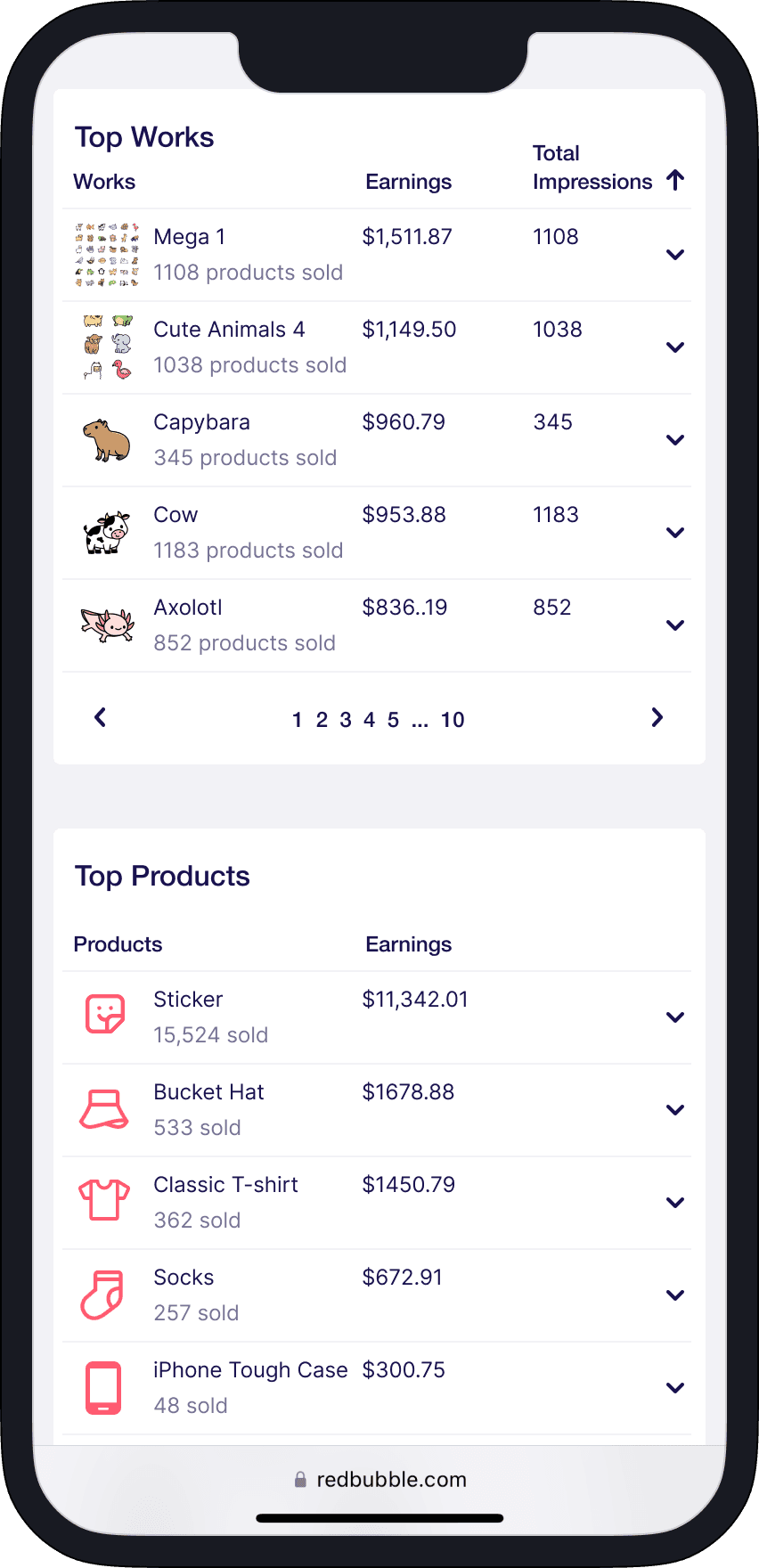
Advanced business analytics
I want to track key performance metrics, so that I can optimize my shop strategy
BACKGROUND
What is Redbubble?
Redbubble is an online marketplace that allows independent artists to sell their designs on a wide range of products such as t-shirts, stickers, and more. It provides a platform for artists to upload their artwork, which can then be printed on-demand on various items.
A sneak peak of my shop @littlemandyart
Problem space
The process of creating a new piece—uploading artwork, adding descriptions, and customizing up to 50 products—can be quite tedious. After five years on the beloved platform, I noticed a lack of effort from Redbubble to automate the creation process for artists. This inspired me to explore solutions from both user and business perspectives in this passion project.
Avg. time to add a new work: 15 min
Source: user interviews with 5 Redbubble artists
The goal
Propose a new user experience that includes…
An seamless end-to-end content creation flow
New feature explorations for experienced artists
DISCOVERY
Business need: user-generated content (UGC)
I began by reviewing Redbubble's 2022 Annual Report to understand their company strategy. One key insight was that artists generate user-generated content (UGC), fueling a cycle that benefits all key stakeholders. With this in mind, I established UGC output as the primary success metric for this project.
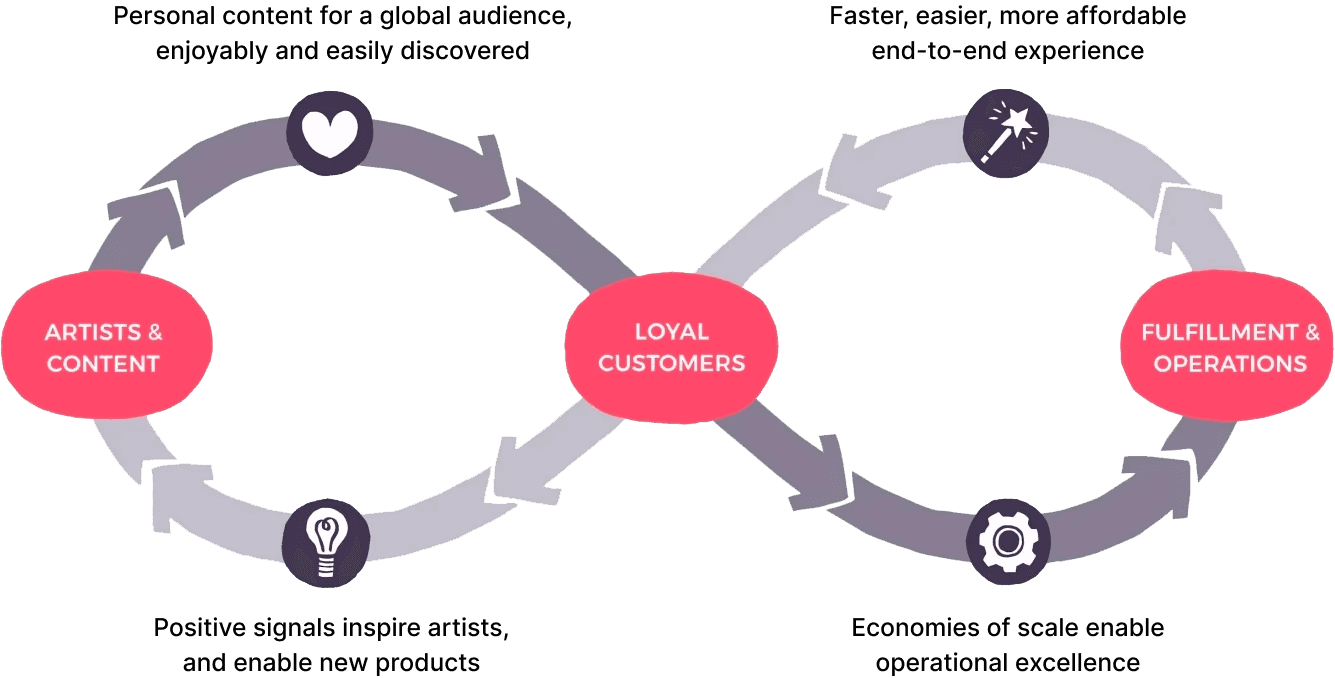
The RB Group Flywheel
USER INTERVIEWS
Hearing the Redbubble community
Next, I sought to understand the goals and pain points of artists, themselves. I invited 5 Redbubble artists (ranging from having 3 to 7000+ followers) to task-based interviews with the following format:
Pre-task Qs — Goals with Redbubble, current workflow, frustrations…
Task 1 — Upload and publish a new work, enabling Kids Clothes only
Task 2 — Enable pins for all existing works
Post-task Qs — Overall experience, challenges, suggested improvements…
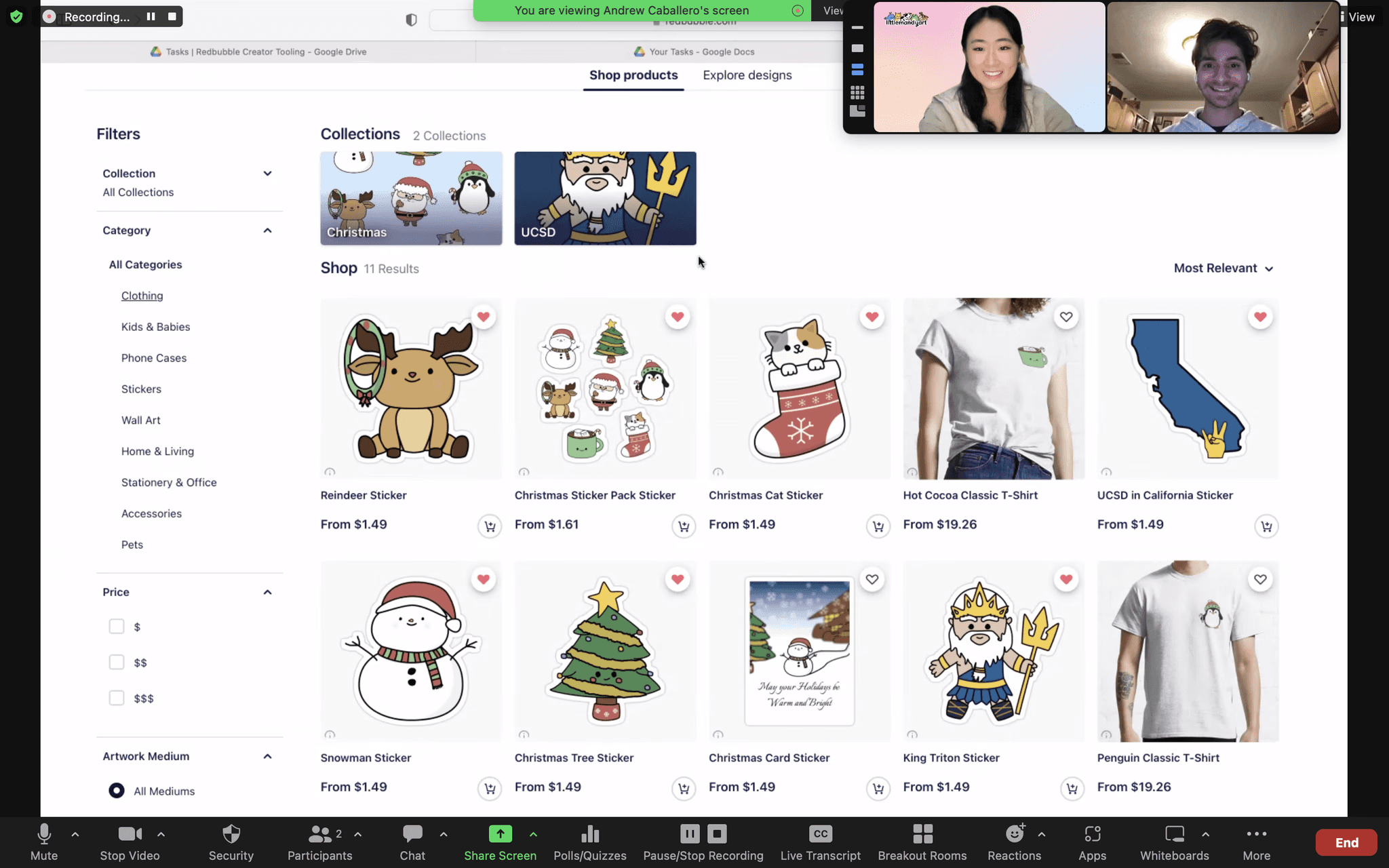
Instagram recruitment and chatting with @AndrewAPicture!
Key takeaways
"I didn't know about Copy Settings. I could have saved so much time!"
@AndrewAPicture
"I downloaded the Redbubble app, but I was only able to shop."
@Terlet Design
(2/5) Low discoverability of tools
(3/5) Lack of mobile creator tools
(5/5) Time-consuming creation
(3/5) Difficulty writing keywords
(2/5) Giving up due to low sales
USER TYPES
Beginner and experienced artists
The user interviews also helped me narrow down target users; I defined experienced and beginner artist profiles based on their distinct needs.
Experienced artist
Is experiencing success on Redbubble, as measured by likes and revenue
→ Core needs: motivation to keep growing their shop—ideally, efficiently
→ Business motivation: user retention, high-quality content
Beginner artist
Still learning how to use Redbubble; makes $50 or less in monthly revenue
→ Core needs: intuitive onboarding, early shop performance indicators
→ Business motivation: user acquisition, diverse content
COMPETITOR SPACE
Analyzing industry trends and technologies
With 34 million monthly visitors, Redbubble was a leader in the print-on-demand (POD) industry. However, it's common for artists to sell on more than one POD site at a time for their needs—in fact, this was the case for 3/5 of my interviewees. I compiled a list of top POD companies:
Rank
Name
Mo. Visitors
1
Merch by Amazon
2.5B
2
Redbubble
34M
3
Zazzle
30M
4
Teepublic
10M
5
Society6
5M
How could Redbubble stay competitive? I tested other similar platforms to see what features they offered creators, finding several opportunities:
Multi-product editor
SOCIETY6, AMAZON
Mobile shop manager
ETSY SELLER APP
Daily engagement stats
How might Redbubble…
Optimize current creation workflows so that artists can seamlessly and rapidly produce UGC for the platform?
While also providing advanced shop tools to retain top artists in a competitive print-on-demand landscape?
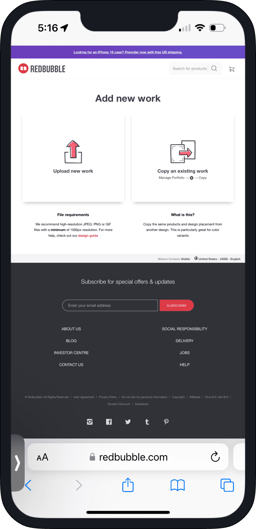
Decision to design for mobile-web
On top of those goals, I wanted to pioneer mobile-web designs for Redbubble. This was my rationale:
3/5 interviewees had attempted to add work on mobile at some point
Etsy found the need to spend resources into building the Etsy Seller App
The current non-responsive UX reflected poorly on Redbubble's brand image
USER FLOW
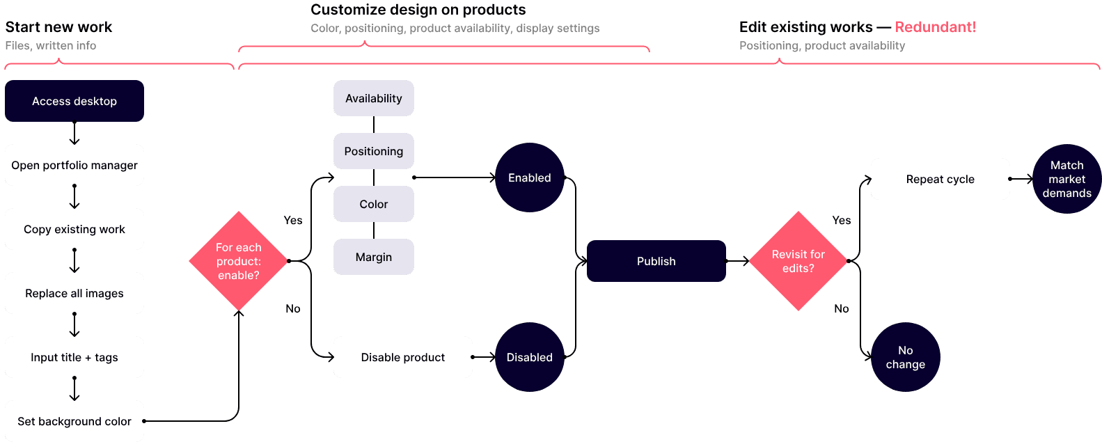
Before: redundant creator workflows
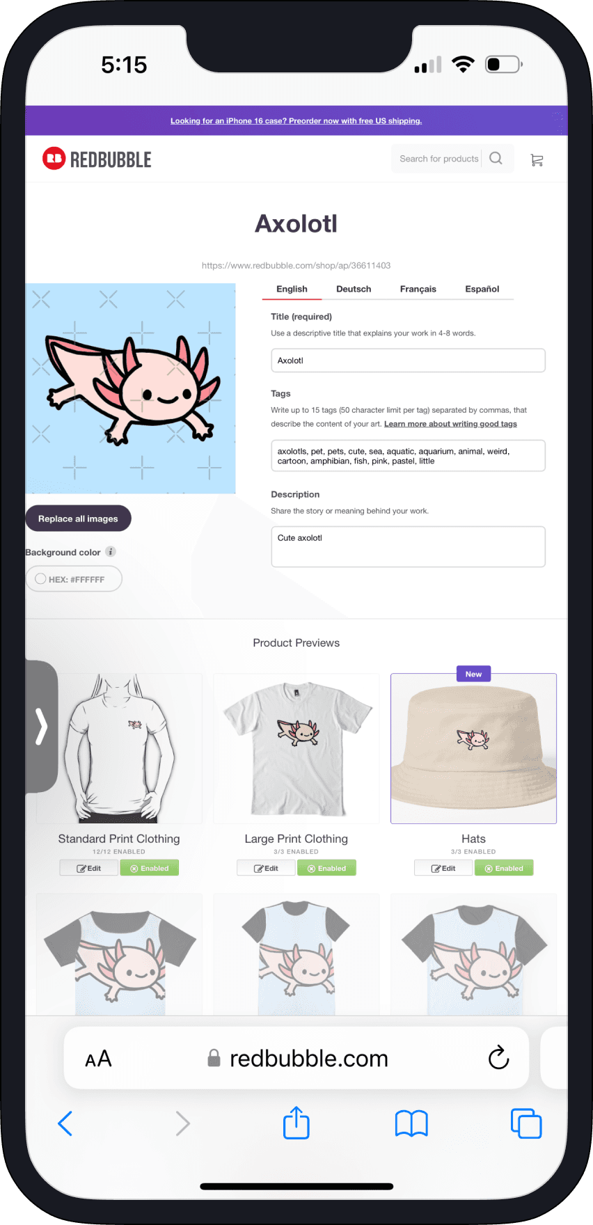
Before designing, I mapped out the end-to-end user flow for creating a work. This revealed that if an artist wanted to edit an existing work, they had to go through the entire creation flow as if they were starting from scratch.
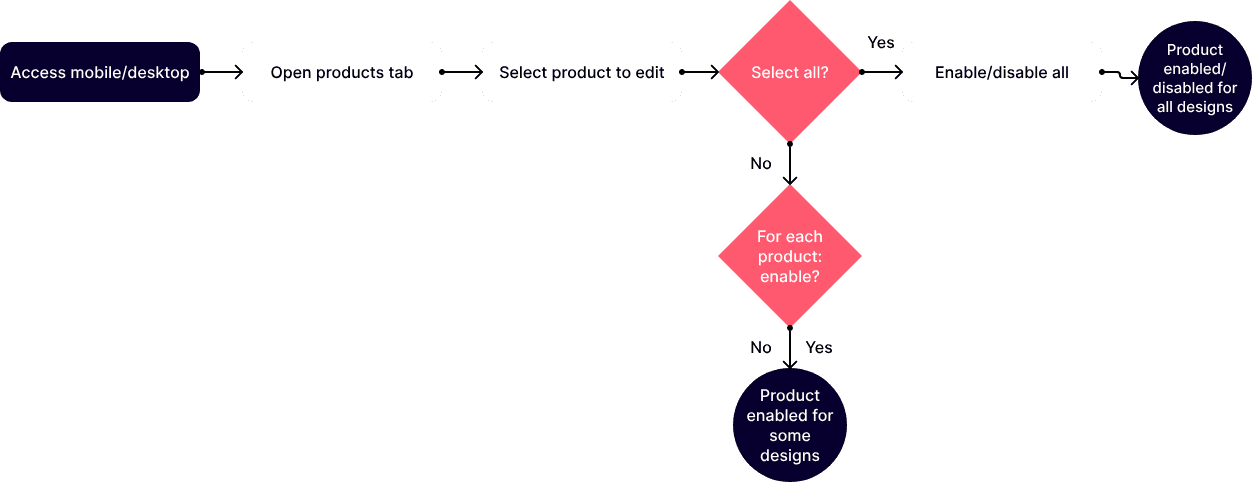
After: separate workflow for editing existing work
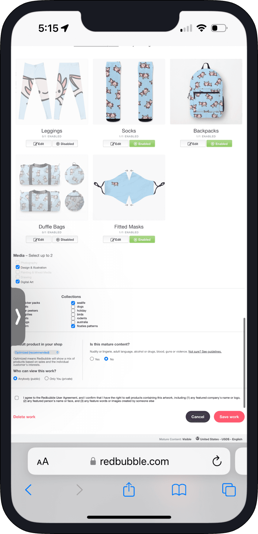
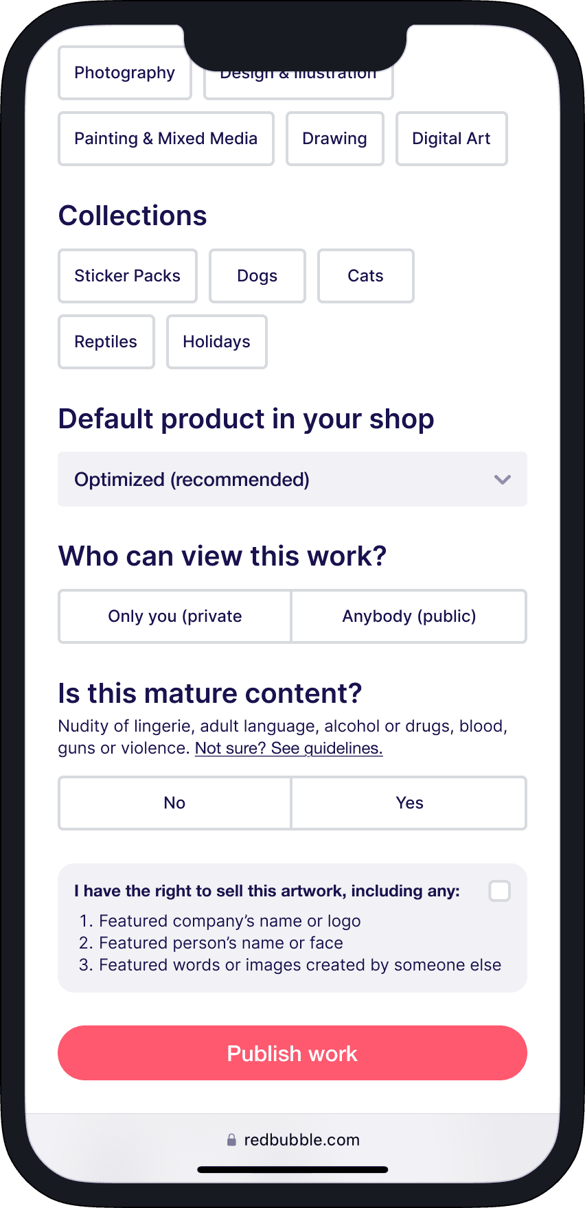
That prompted me to create a separate, simplified user journey for editing an existing work. The artist is able to edit products for a given design from one page and complete the process in fewer clicks.
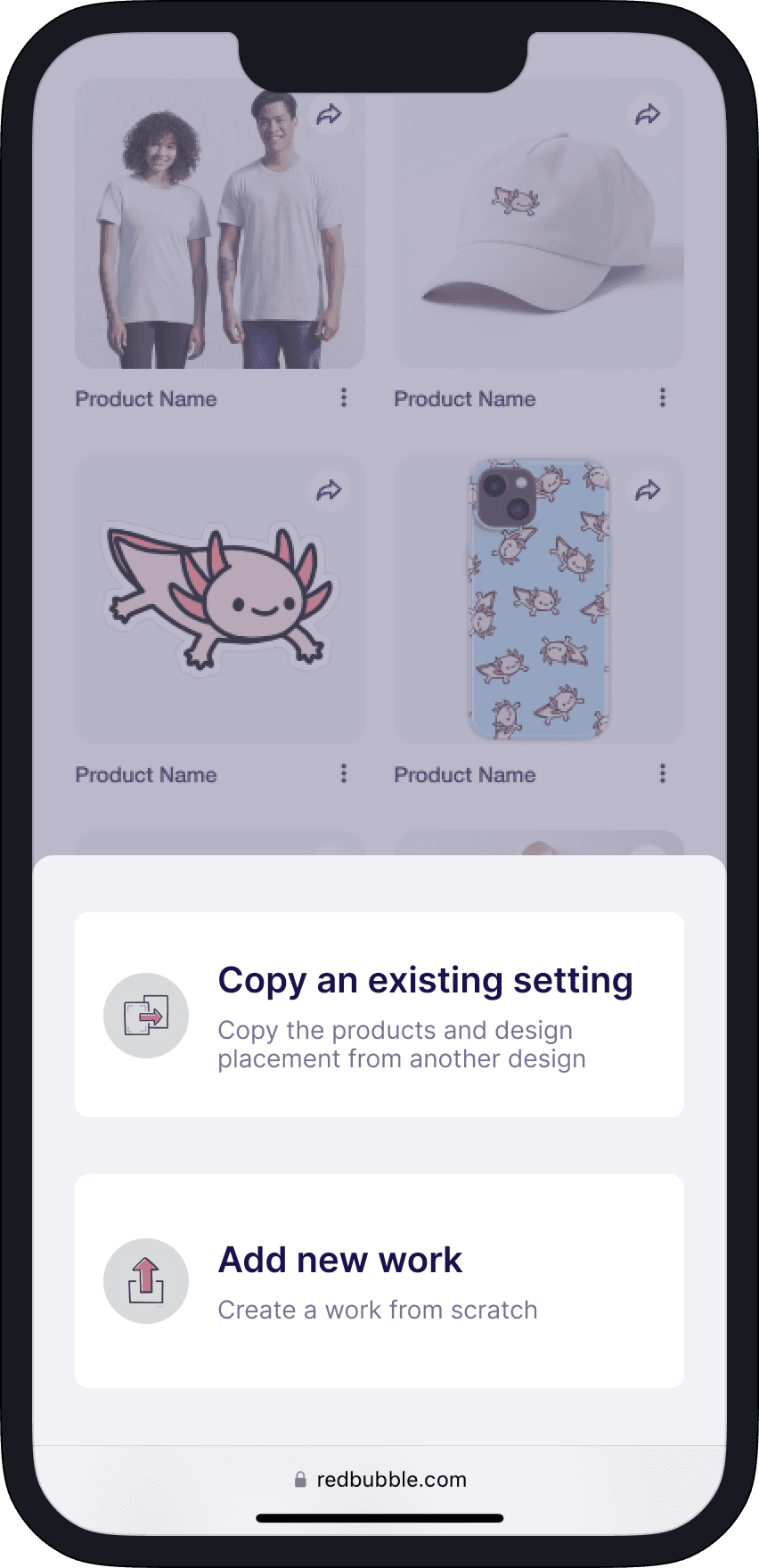
MID-FIDELITY DESIGNS
Conceptualizing the flow
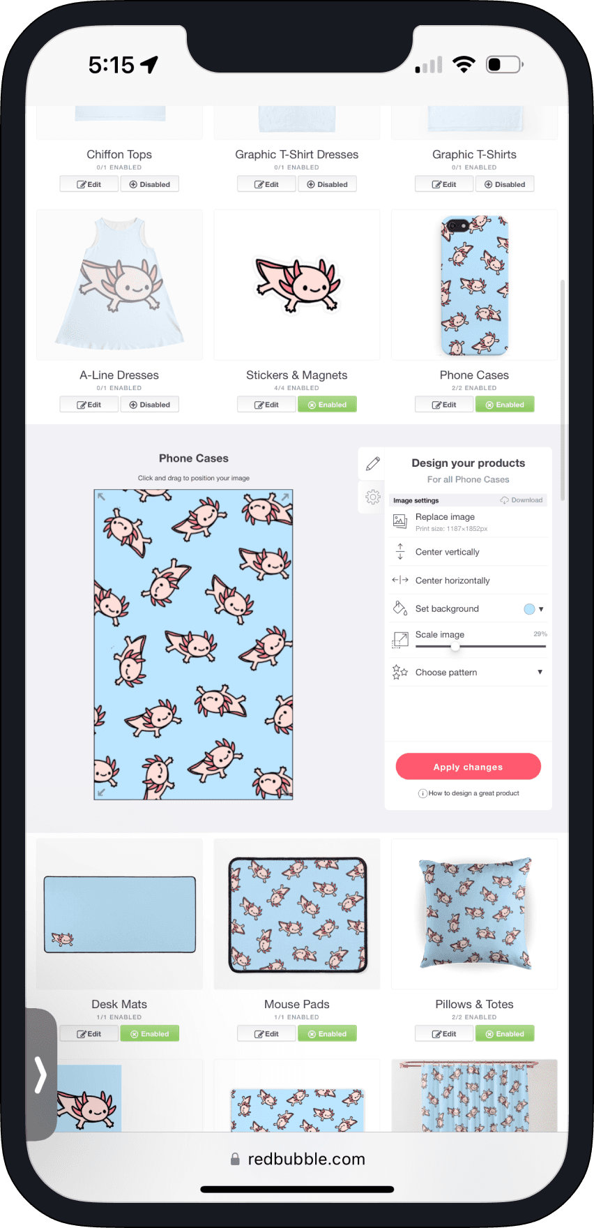
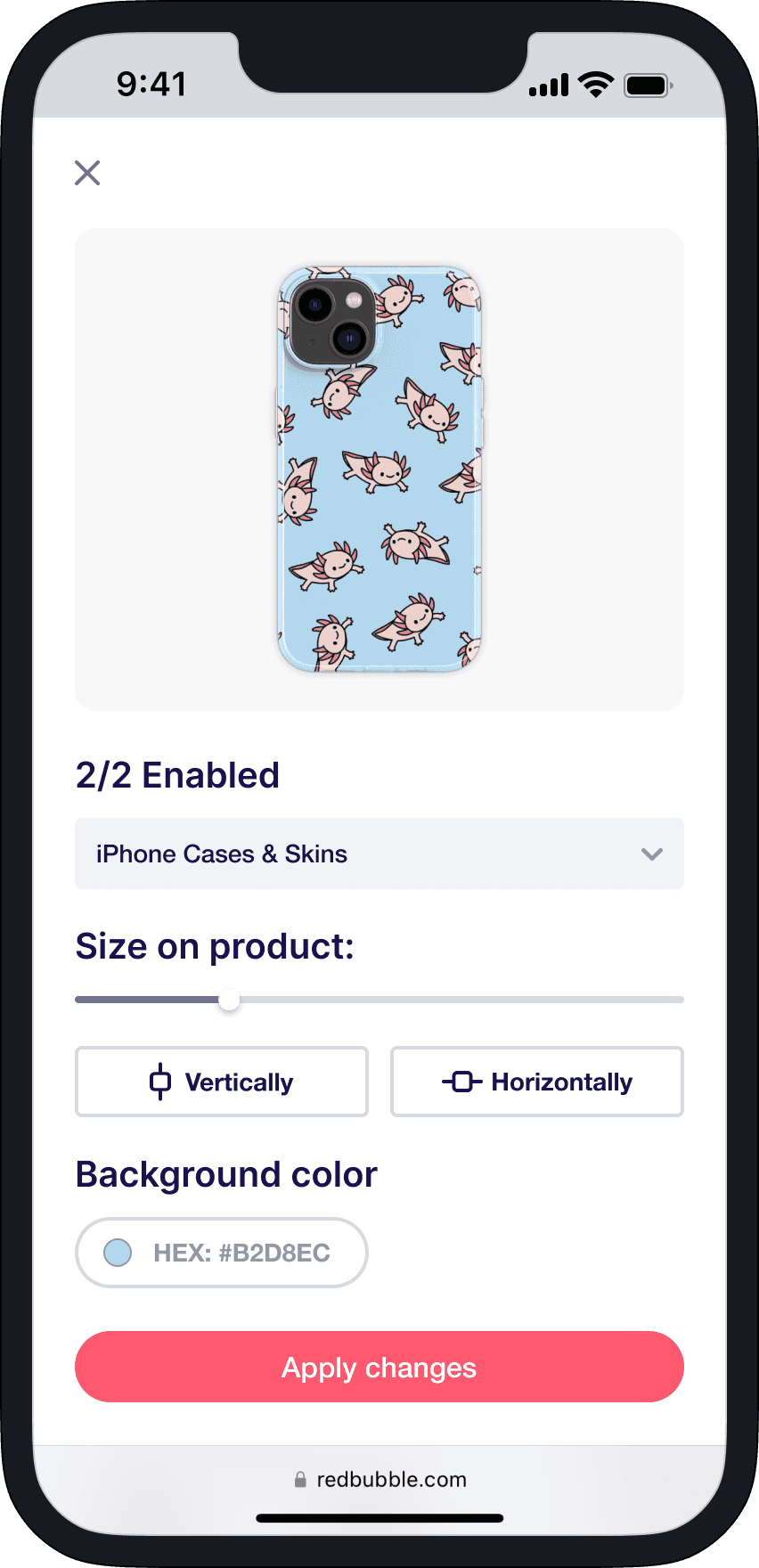
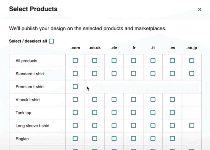
In the new 'Products' tab, artists can edit their works and availability for products, such as Pins, to ensure consistency in the items they offer.
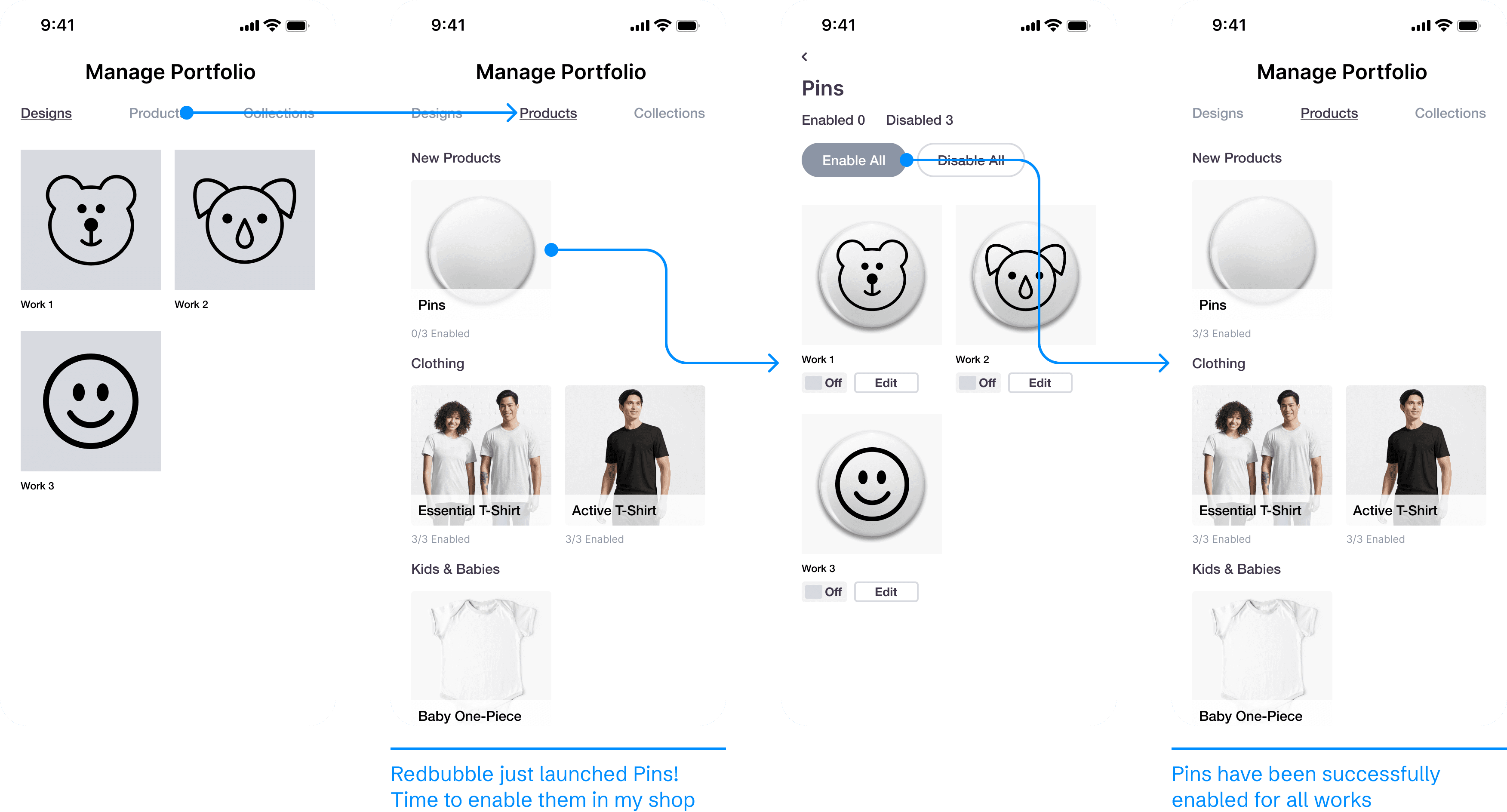
USABILITY TESTING
Testing with a new group of artists
As soon as a I had a minimum viable product (MVP), I launched a usability test with a new group of 5 Redbubble artists. The goal was to assess the ease of completing the original two tasks with the redesigned prototypes.

Task 1 — Add new work

Task 2 — Edit existing work
Results:
40% decrease in task interruption rate for adding new work
Reduced no. of clicks by 5 for editing an existing work, per product
4/5 participants did not initially find the 'Products' tab
3/5 participants made misclicks
Action:
Given the 3-week time constraint of this project, I decided to focus on addressing the misclicks problem by iterating on the mobile interface.
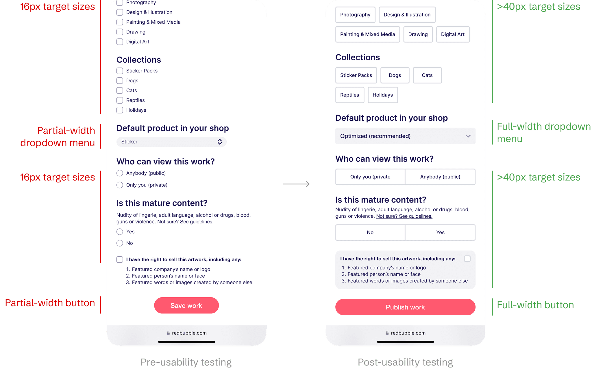
DESIGN ITERATION
Incorporating mobile best practices
You could say that my first attempt was a fail; I merely copied the design patterns from desktop web. This time around, I studied the Apple Human Interface Guidelines and modern mobile web applications. This helped me design familiar components with larger target sizes.
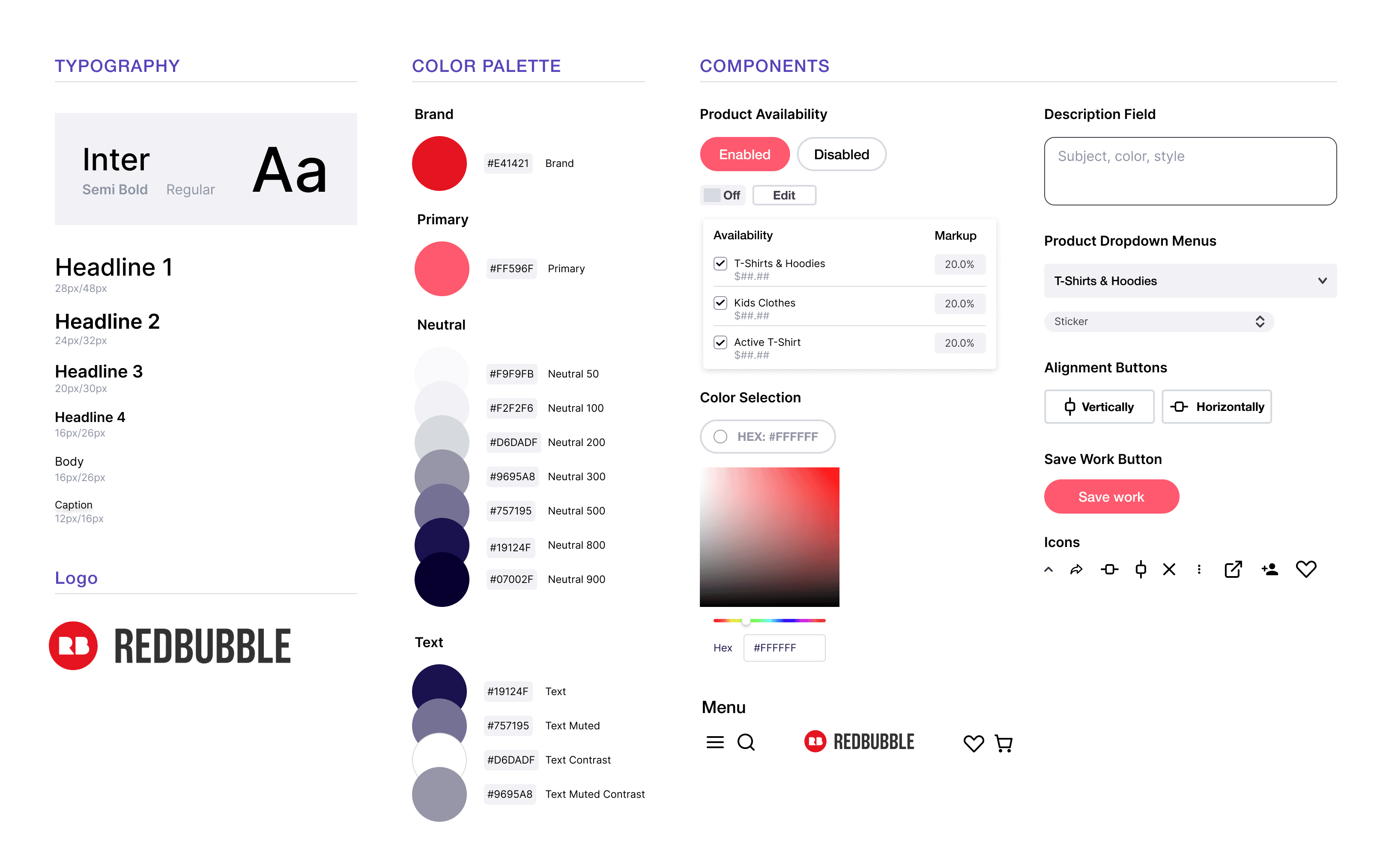
DESIGN SYSTEM
Mobile-web design system
I developed a mobile-web design system based on Redbubble's open-source design system to create reusable styles and components for my prototypes.
So, what did I solve?
For concision, I didn't cover all my design explorations or process work. Feel free to revisit my Final Solution to see the end result again. Take me back up
Optimized the workflow for editing existing works
Provided fresh ideas for advanced creator tools, including business analytics
IMPACT
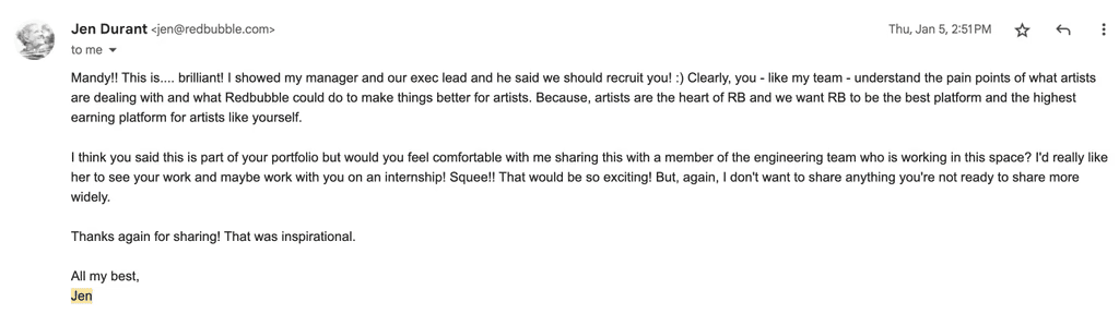
Share-out with a Redbubble PM
I shared my project with my Artist Relationship Manager, Jen. To my pleasant surprise, she invited me to speak with a Product Manager on the Artist Experience team. I was excited to meet her, gain feedback on my ideas, and learn about the potential engineering lift of my solutions.
REFLECTION
That's a wrap! P.S. this is my proudest project
If I had more time
Resolve pain points in the 'Products' tab
The usability test revealed that this new feature was easily overlooked. I'd want to go through more design iterations and eventually another usability test to increase discoverability.
What I would've done differently
Do less
I tried to do so much at once! I wish I had set a more focused direction for this project, also to be able to measure the impact of my work more directly.
Learning
Product thinking
Throughout the project, I kept Redbubble's larger goal of increasing UGC in mind. Each design decision could be tied back to that goal and other data.