
OVERVIEW
FixNation is a nonprofit that strives to build a better world where tame cats have a home, and homeless cats are spayed/neutered in their outdoor homes. I worked in a cross-functional team on the end-to-end design of a responsive landing page that spreads awareness of FixNation's mission and volunteer opportunities. In marketing, we focused on appealing to a younger audience.
ROLE
Product Designer
TIMELINE
December 2022
to May 2023
SKILLS
UX/UI Design
Agile Methodology
Design Systems
Usability Testing
TEAM
4 Designers
1 Product Manager
8 Developers
Scroll through!
PROBLEM
I first spoke with our clients at FixNation to understand their organization, mission, and vision. Then, I documented their needs in a design brief covering many high-level problems:

Karn, Executive Director

Kimberlie, Board Member
💡
"Our current website does not address ways to get involved."
💡
💡
"Lack of connection with the younger generation in regards to this issue."
SECONDARY RESEARCH
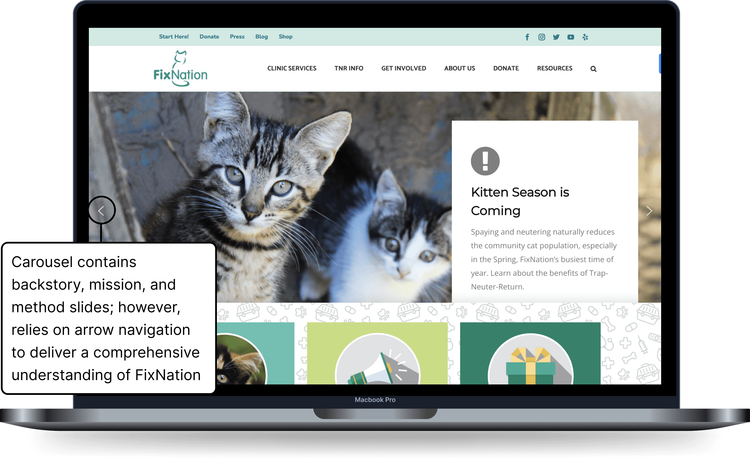
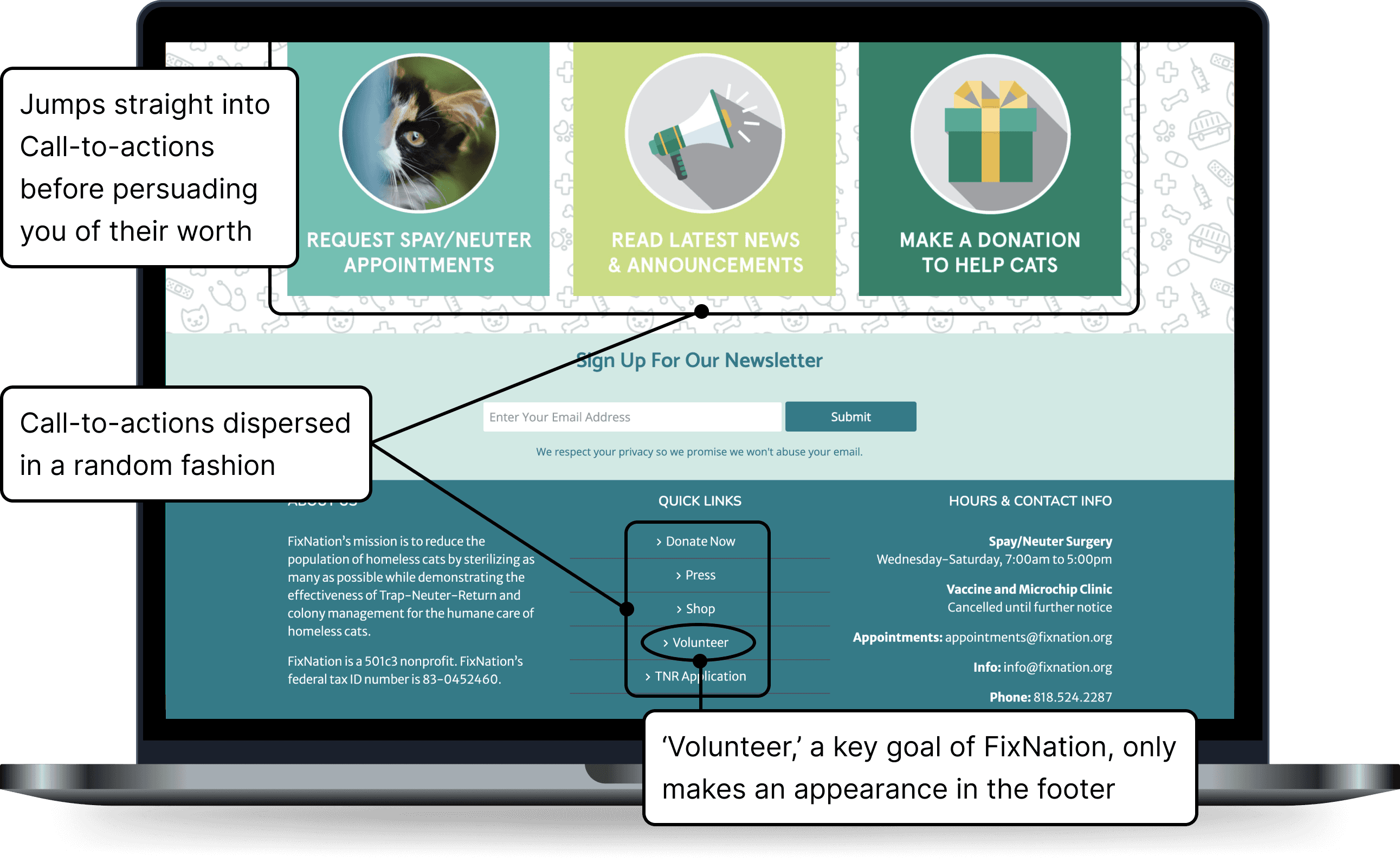
I took a closer look at FixNation's website to visualize our client's concerns: nested content and cluttered CTAs hindered the website's ability to communicate information.
USER PERSONAS
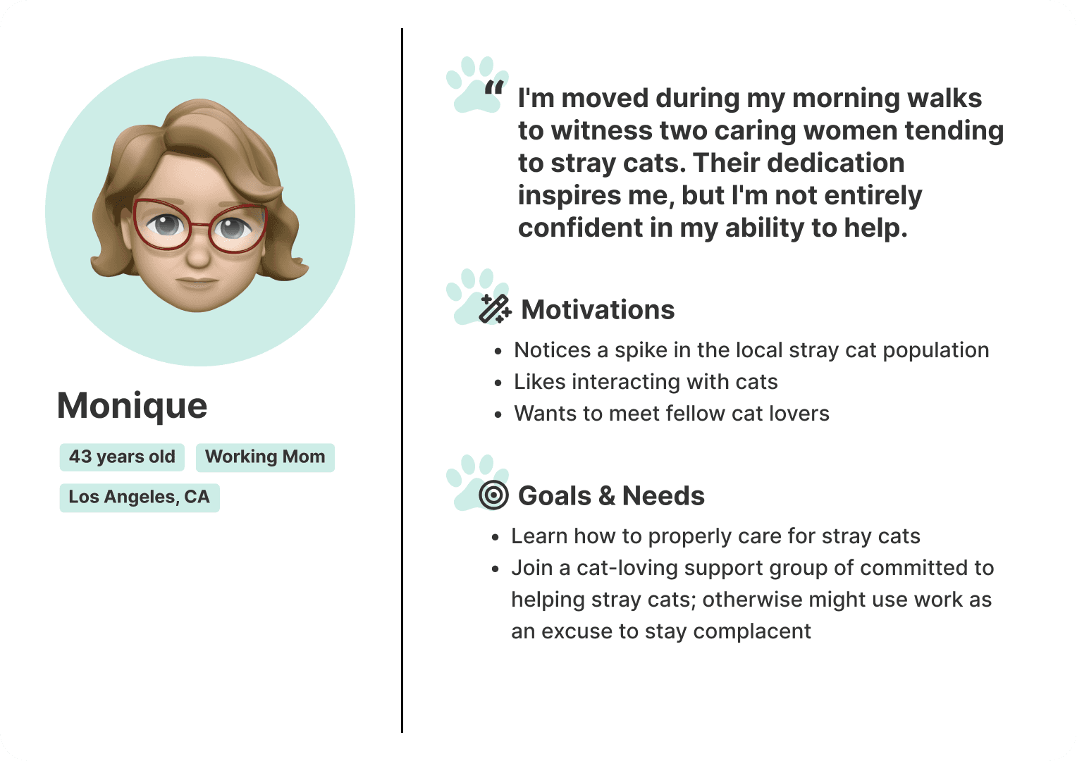
Because FixNation said they wanted to appeal to youths, who typically lack knowledge on homeless cat fixing, I created user personas for youths and non-youths (middle-aged adults). This helped us empathize with their needs during brainstorming and onward.
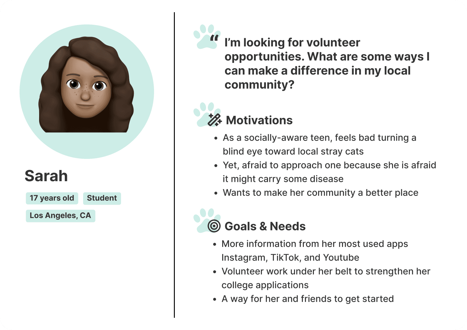
Gen Z persona
Non-Gen Z persona
Deliver content from FixNation's original website to cater to a new target audience, Gen Z (ages 11-26)?
Create a separate landing page that combines storytelling with playful interactions to onboard Gen Z to FixNation's history, mission, and ways to get involved.
IDEATION
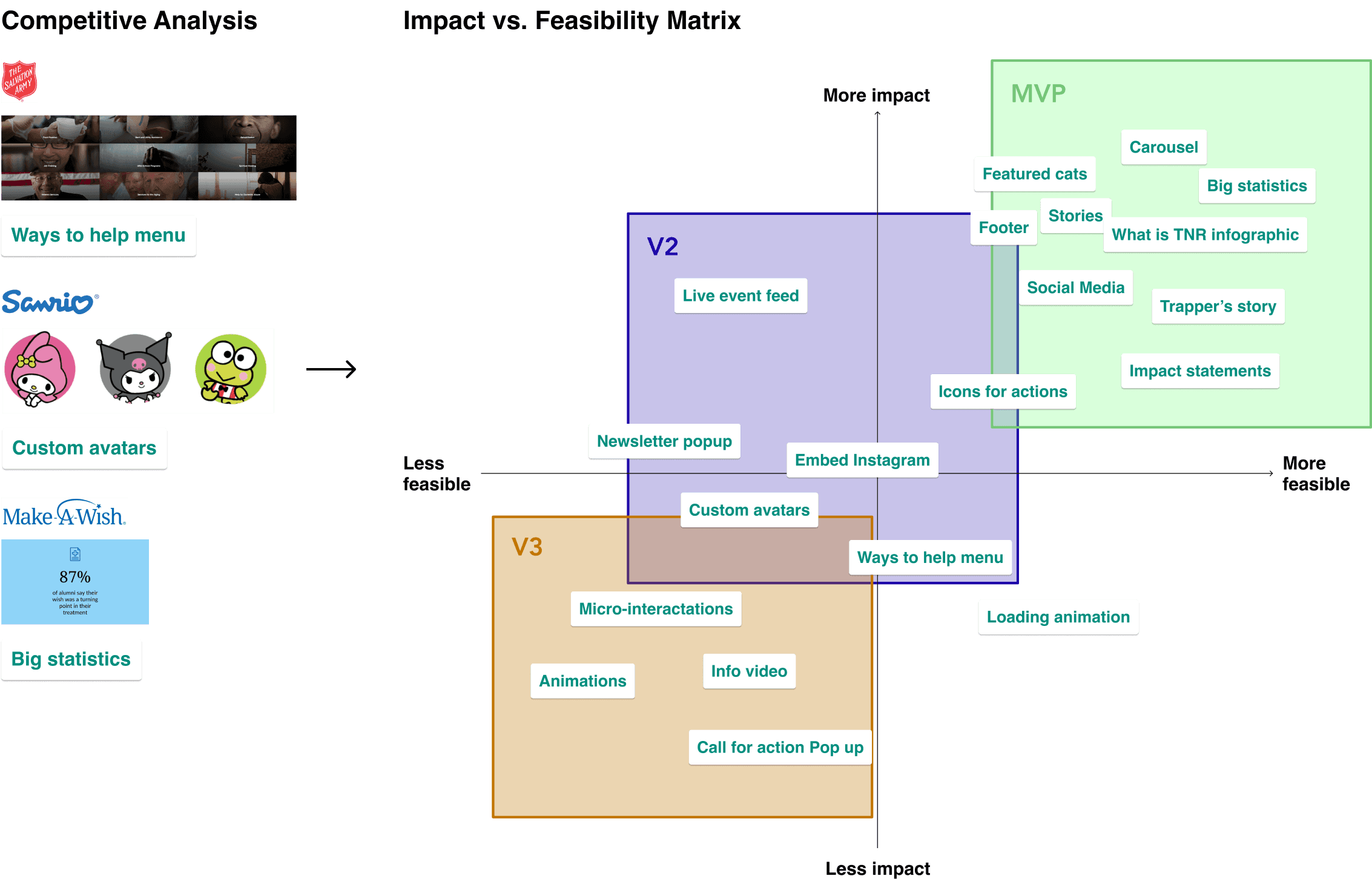
To set the scope for our project, I constructed an impact vs. feasibility matrix that prioritized features across the MVP, V2, and V3 development stages ahead. These features were inspired from our initial competitive analysis of 24 animal and humanitarian-related sites.
USER FLOW
Upon reaching the landing page through one of many entry points, the visitor would encounter key call-to-actions including "Donate" and "Volunteer." Then they'll digest information about FixNation's offerings in the subpages and engagement activities that follow. At the end, the visitor is given yet another chance to Donate or Volunteer.

About, Statistics, etc. represents the page's information hierarchy
PROJECT MANAGEMENT
At Triton Software Engineering, we believe design and development should be a collaborative effort that doesn’t take place in silos. We took an agile approach involving weekly designer-developer meetings to hand off new design iterations. Our project timeline was as follows:

DESIGN DECISION
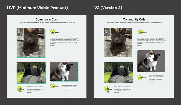
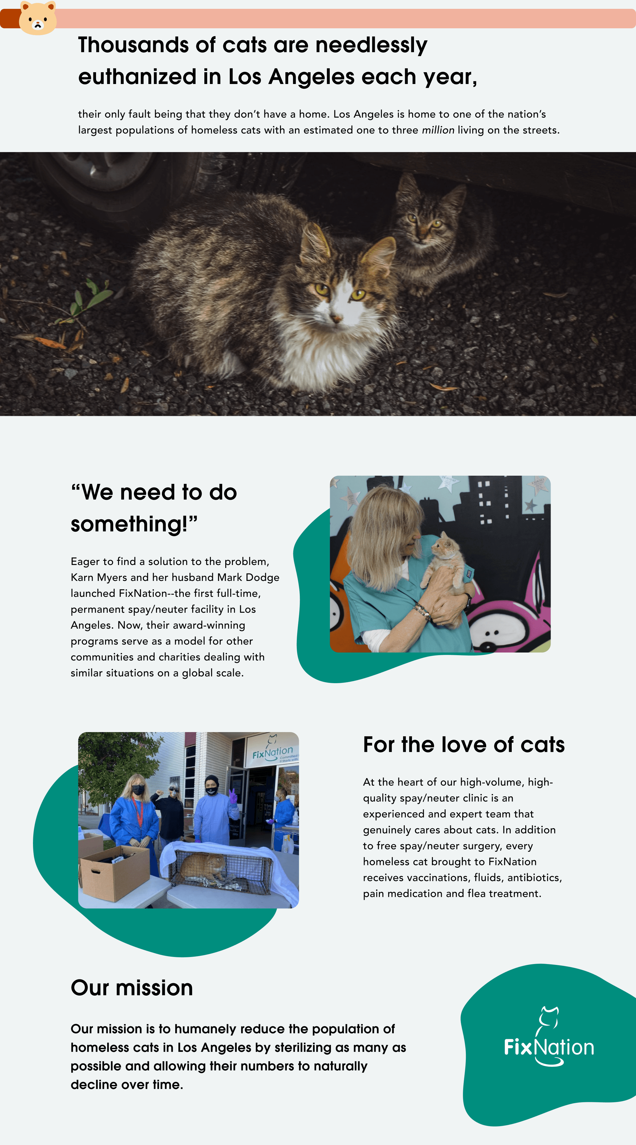
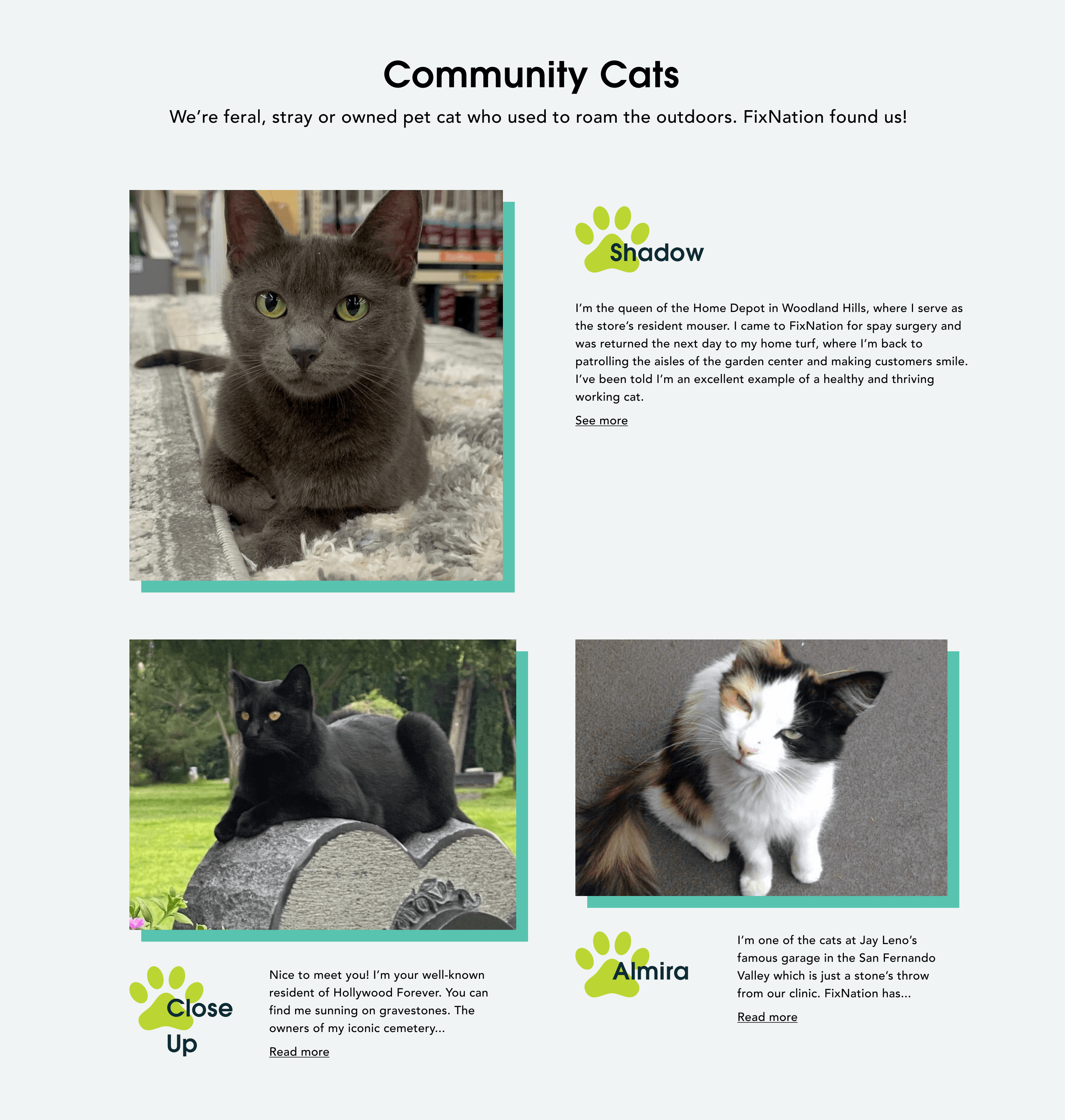
Then, the challenge was to organize FixNation's existing content into one unified page. I favored a layout that supported more storytelling and interaction with the cats.
Selected for MVP
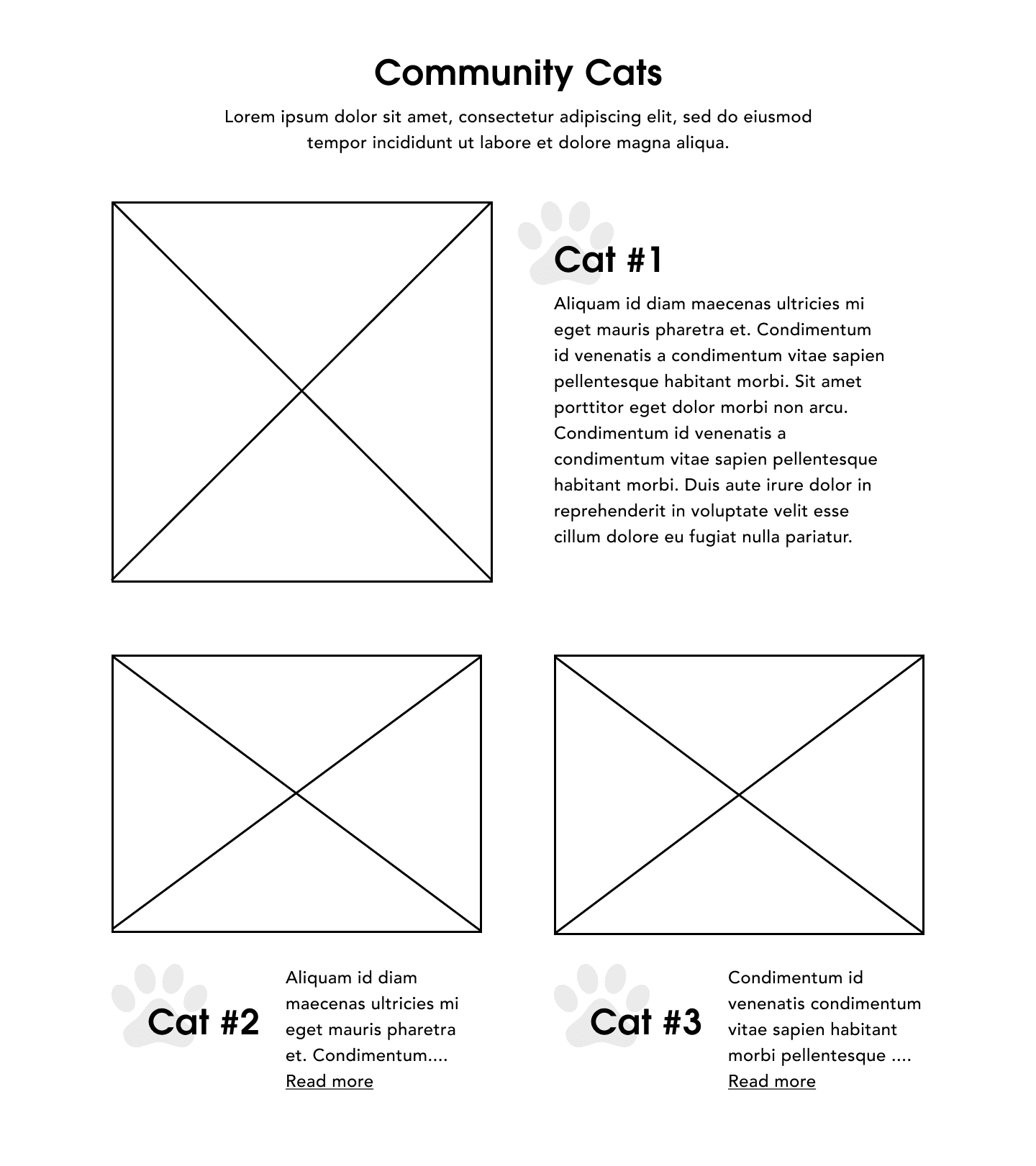
Alternative
💡
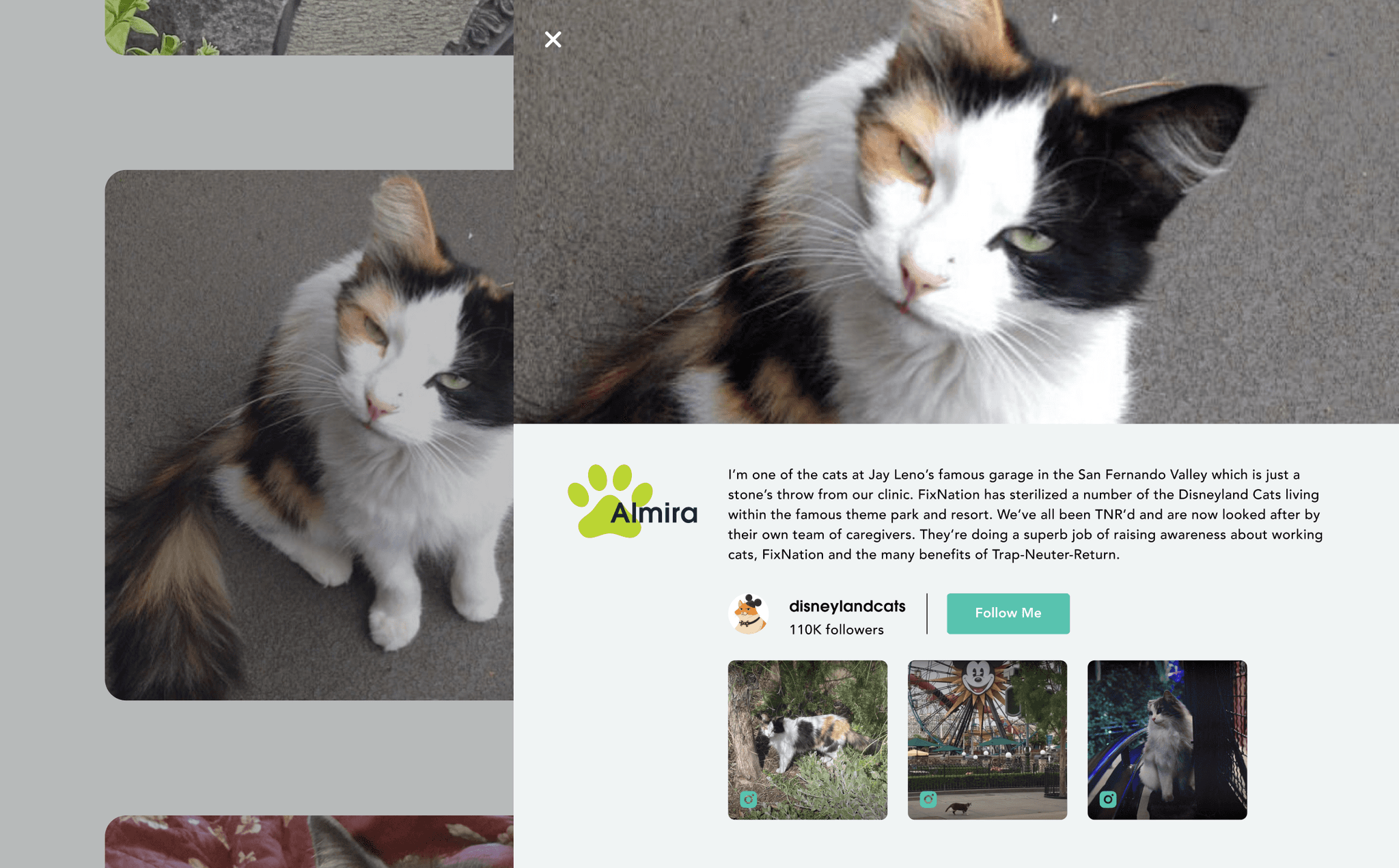
While the alternative version displays images of each cat, the selected version provides interesting background in brief descriptions. These serve as hooks with the option to engage further by clicking 'Read more.'
CROSS-FUNCTIONAL COLLABORATION
In a designer-developer meeting, I received pushback when I proposed a new feature, Instagram profiles, for "Cat Stories." In this initial moment, I struggled to connect the dots to our core goal of engaging youth users.
Already implemented in MVP

"Read more" —> Full description
Recommendation for V2
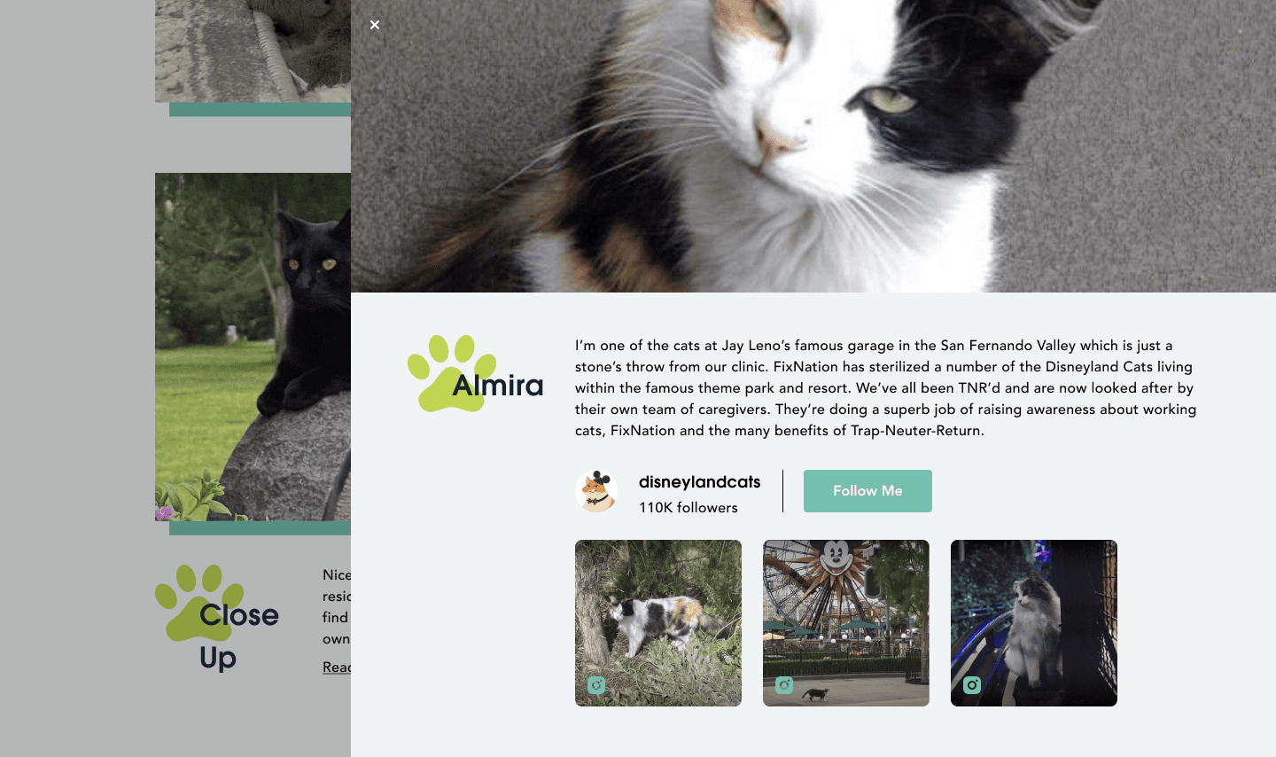
"Read more" —> Full description + Instagram profiles
Problem — Skepticism from our developers
During the design-dev meeting, developers expressed their reservations about the current version already looking complete, updating image thumbnails each time a new photo was posted, and being busy with other tasks at the time.
Action — Present compelling stories and data
That same meeting, I explained how adding Instagram profiles of real cats resonate with our Gen Z persona. I also highlighted the need for media mentions—a common marketing strategy—to reinforce the value proposition for volunteering at FixNation. To address their concern with thumbnails, I shared an Instagram embed plugin resource.
Result — Implemented efficiently using a social media embed plugin
Our developers implemented the Instagram profiles within one week for users to enjoy. This turning point renewed a sense of collaboration and purpose for the month ahead.
USABILITY TESTING
At the V2 development stage, I recruited 9 TSE designers to provide their reactions to our hi-fi V2 prototypes directly in Figma. If give more time, I would have proposed user testing with the landing page's actual target users, Gen Z.
Task 1
Give overall feel of the V2 prototype.
My suggestion to collect raw reactions before targeted questioning
Task 2
Compare and contrast MVP vs. V2.
Task 3
React out loud to the responsiveness.
USER INSIGHTS
User insights revealed positive reactions to the mobile designs and emotional appeal of images as well as negative reactions to layout and usability. Afterwards, I translated these insights into action items for V3.
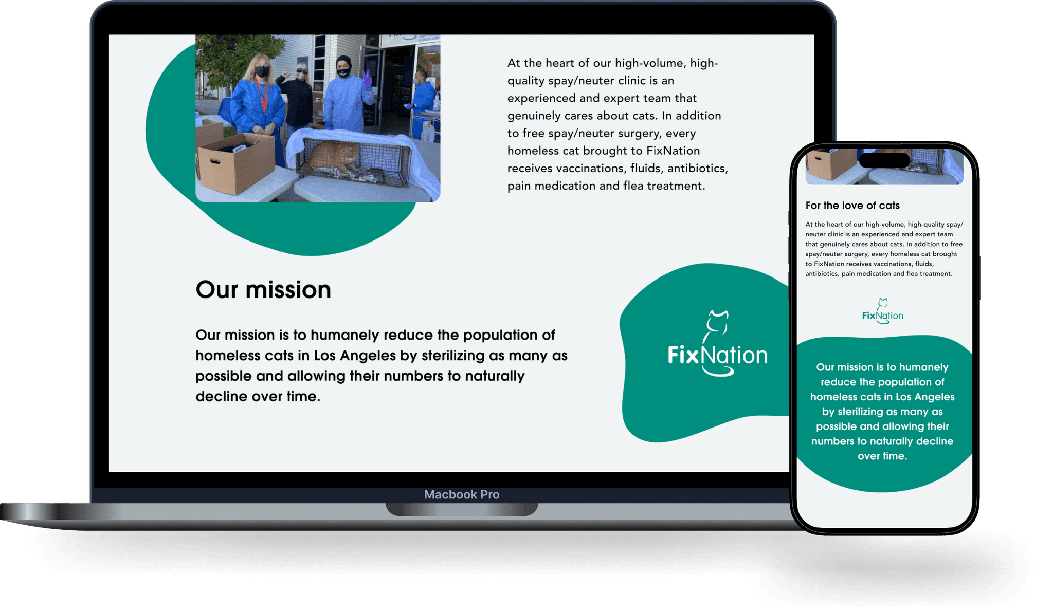
UI DESIGN
To establish consistency across page sections and platforms, I created FixNation's first design system. I translated FixNation's provided assets into reusable styles and components. I created vector cat icons to express their playful brand identity.
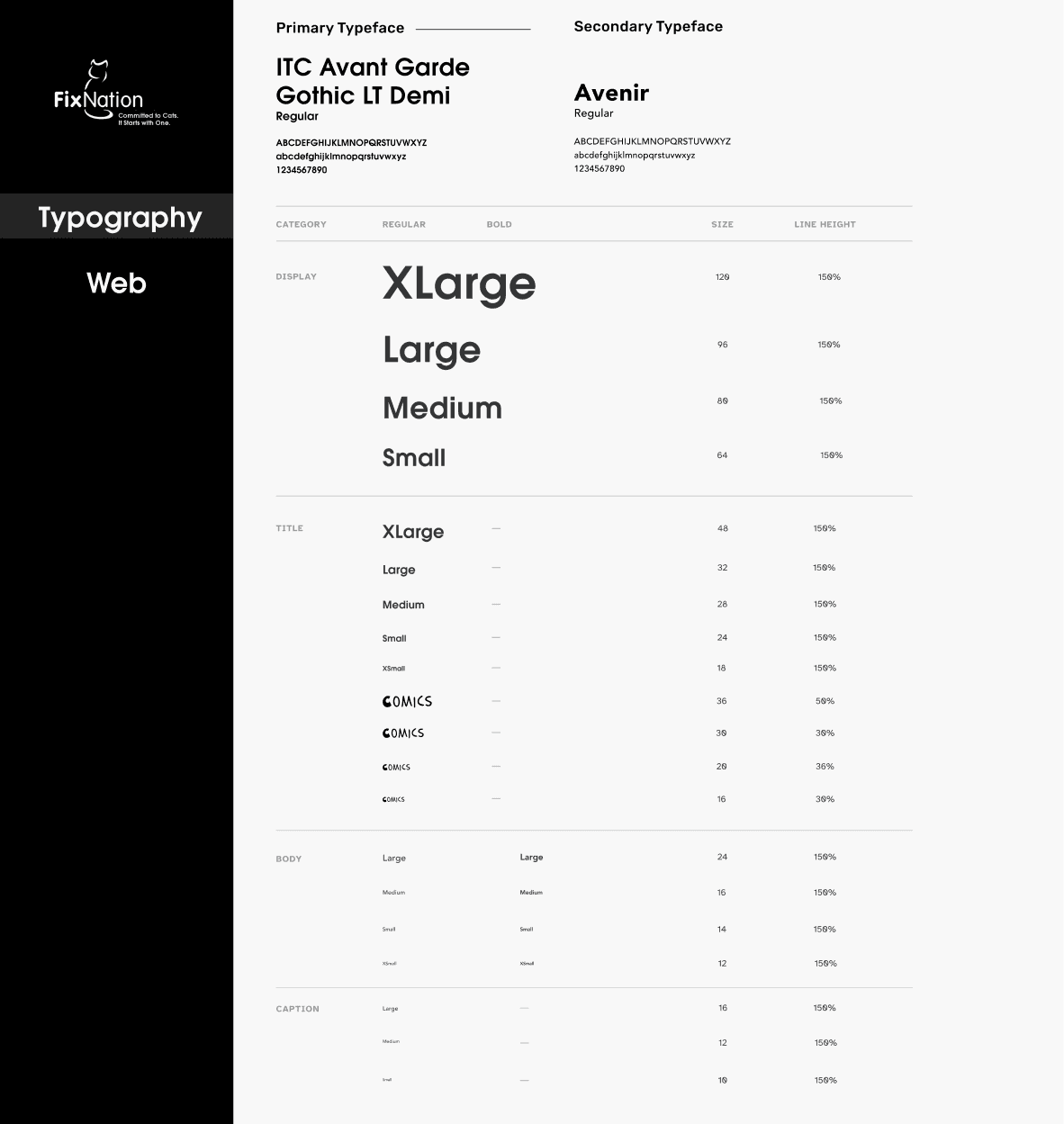
Text hierarchy for cross-platform web design
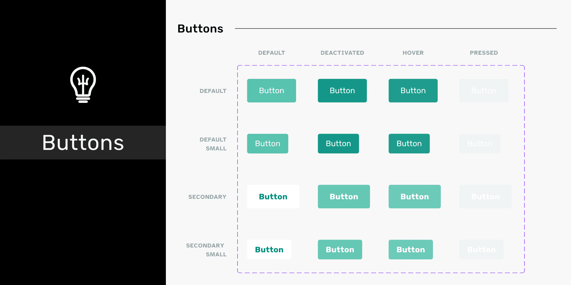
Every button state for developers to execute

Current colors defined as primary or secondary
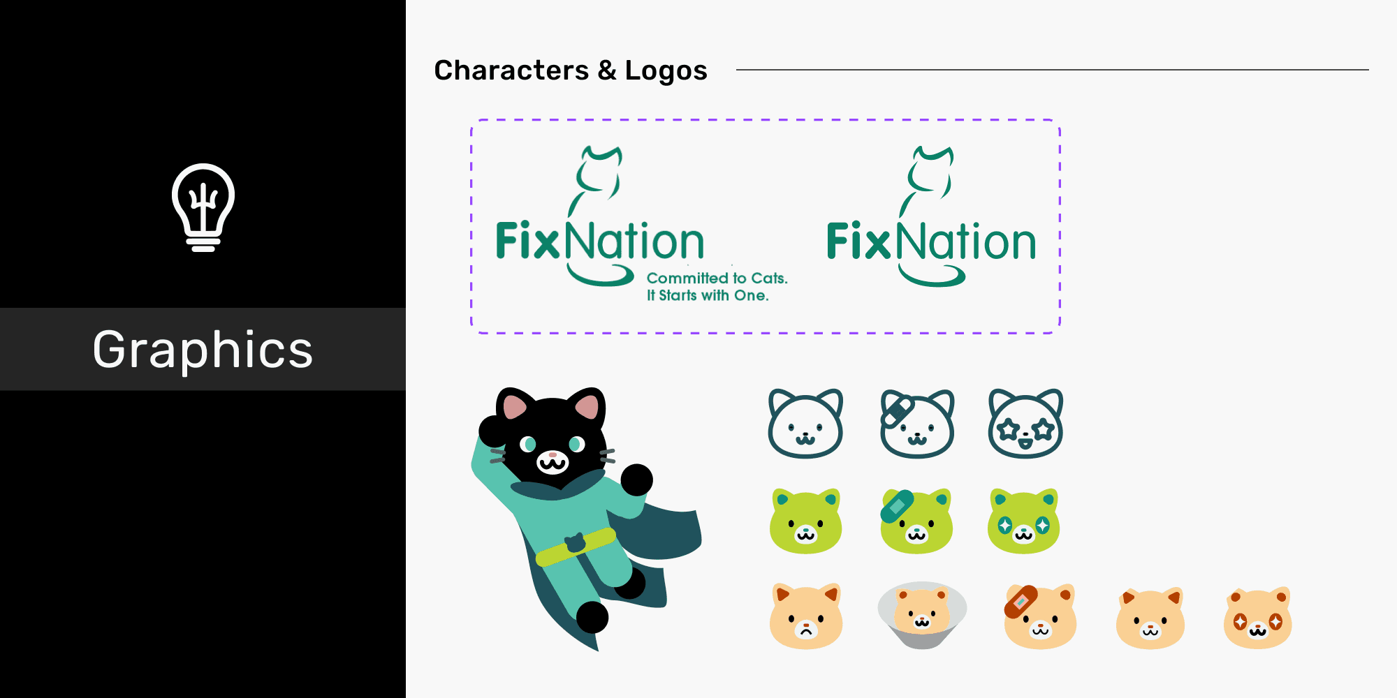
Logo variants and custom cat icons
ITERATION
Between the MVP and V3 development stages, I enhanced usability through best layout practices and user engagement through interactive elements.
Improvements to About
MVP (Minimum Viable Product)
V3 (Final Version)
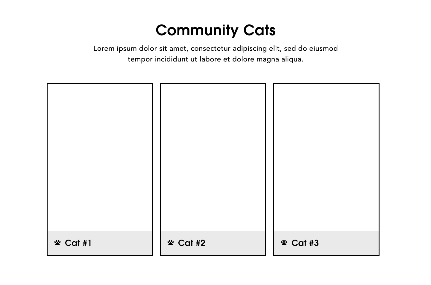
Improvements to Community Cats
MVP (Minimum Viable Product)

V3 (Final Version)
FINAL SOLUTION
MEASURE
Shipped on time
I spent the final two weeks clarifying implementation details to developers to help ensure that the site would turn out accurately. One challenge was standardizing text sizes across breakpoints and across subpages from different designers. Ultimately, we published on schedule.
Client feedback
"More professional than supposed professionals we’ve worked with"
"This is exactly what we wanted"
"Now we want you to do our main website"
Success metrics
The web analytics revealed 1,300+ page visits and 80,000+ hits during launch month. Given access to more detailed analytics, I'd use bounce rate and conversion rate to measure the impact of the marketing site.
REFLECTION
User-centered practices for providing value to a target audience
I sought to understand Gen Z's needs (discovery of FixNation), preferences (social media and games) and goals (community involvement) then address their needs in a final solution.
Design exploration for unlocking different options
I wish I was more bold with design exploration between the MVP and V3 stages. A potential solution could have been conducting more frequent competitive analysis to gain inspiration.
Communication strategies for effective implementation
This gave me a glimpse into what it's like to work in industry alongside developers in agile sprints; explaining how to export files and designating a single source (prototype) of truth in Figma led to more successful handoffs. When working with designers, I learned the importance of contextualizing design decisions.
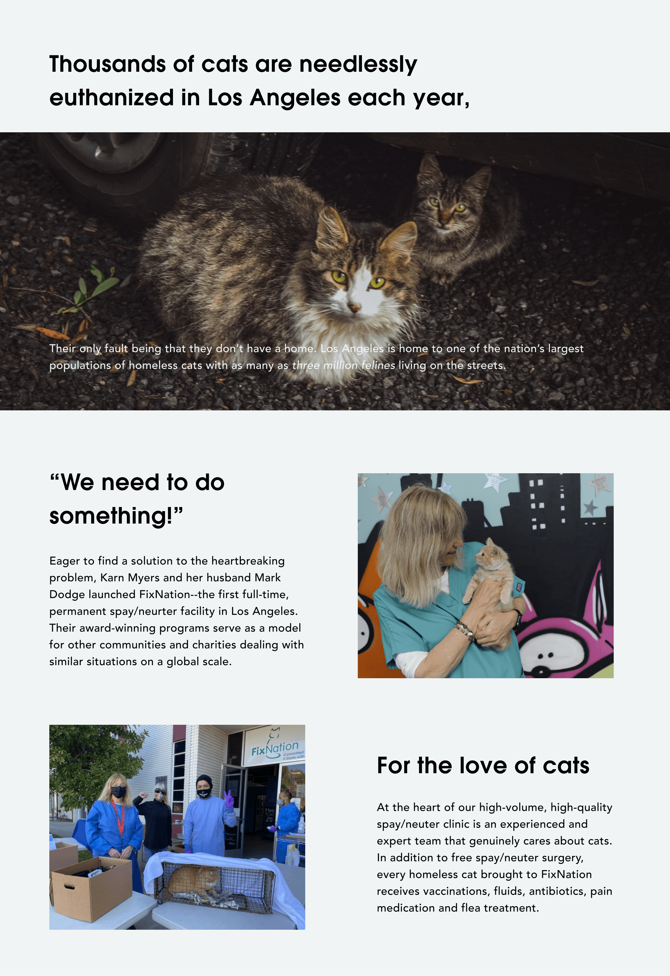
It was an honor to help tell FixNation's story to the online world. Thank you to Karn and Kimberlie for being our #1 supporters and communicators throughout. Fun fact: these superstars have served more than 250,000 cats!